← All work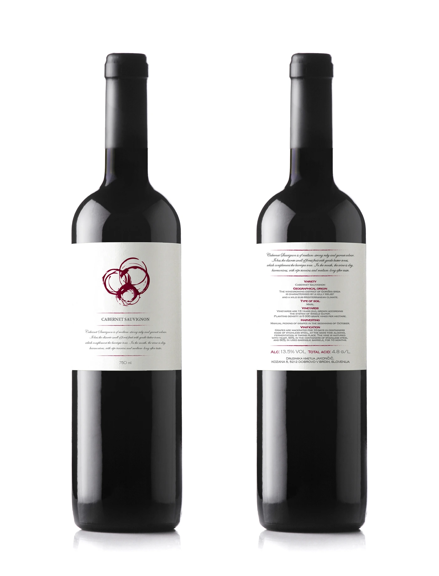 Wine & Spirits Labels
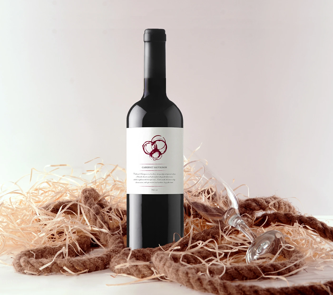
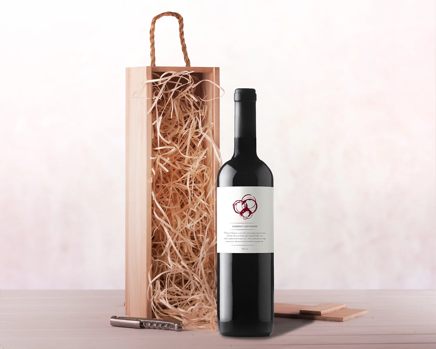 Bottle on shelf · 3:2
 Label flat artwork · 3:2
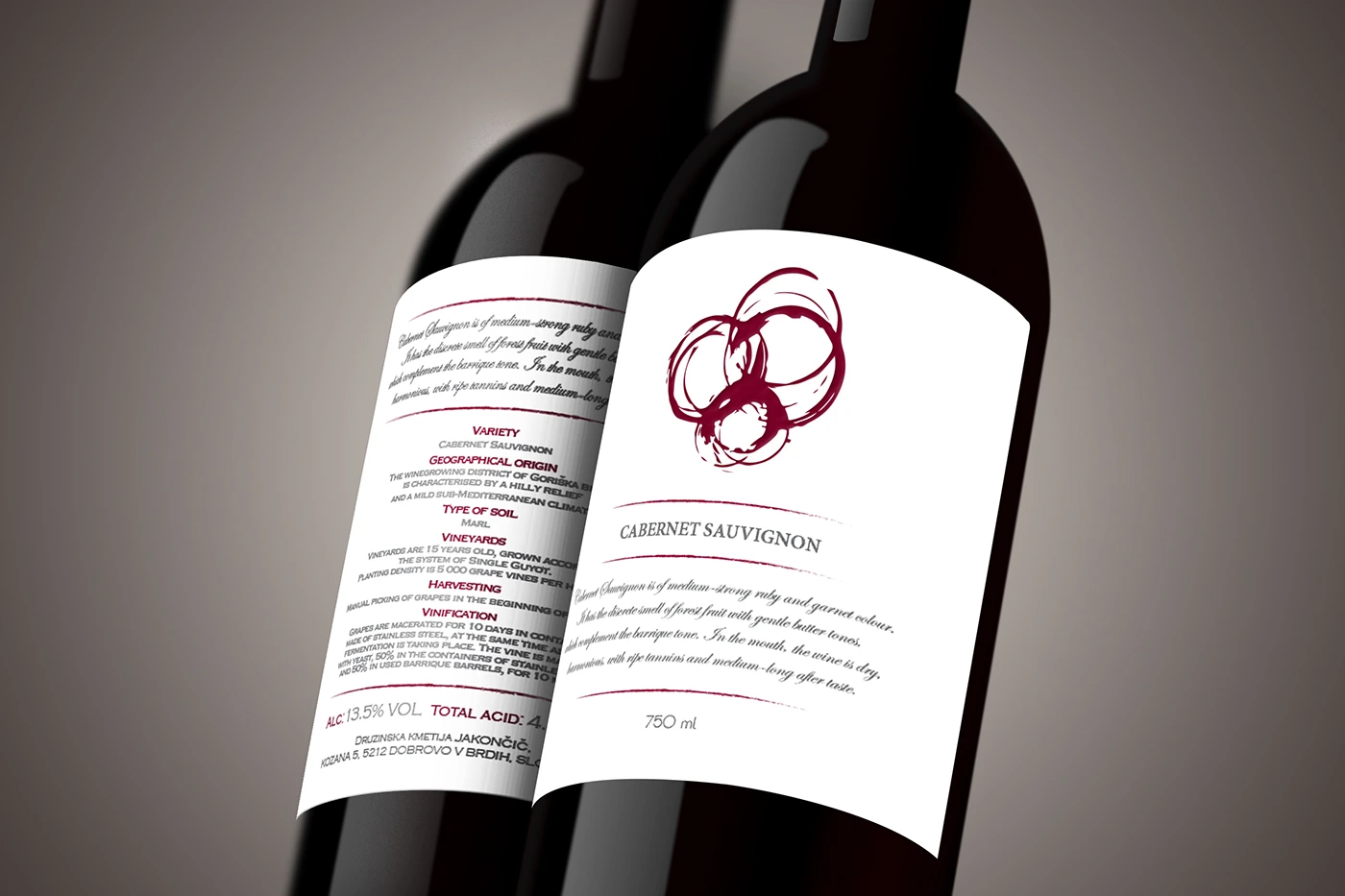 Label detail on the curve · 4:5 · macro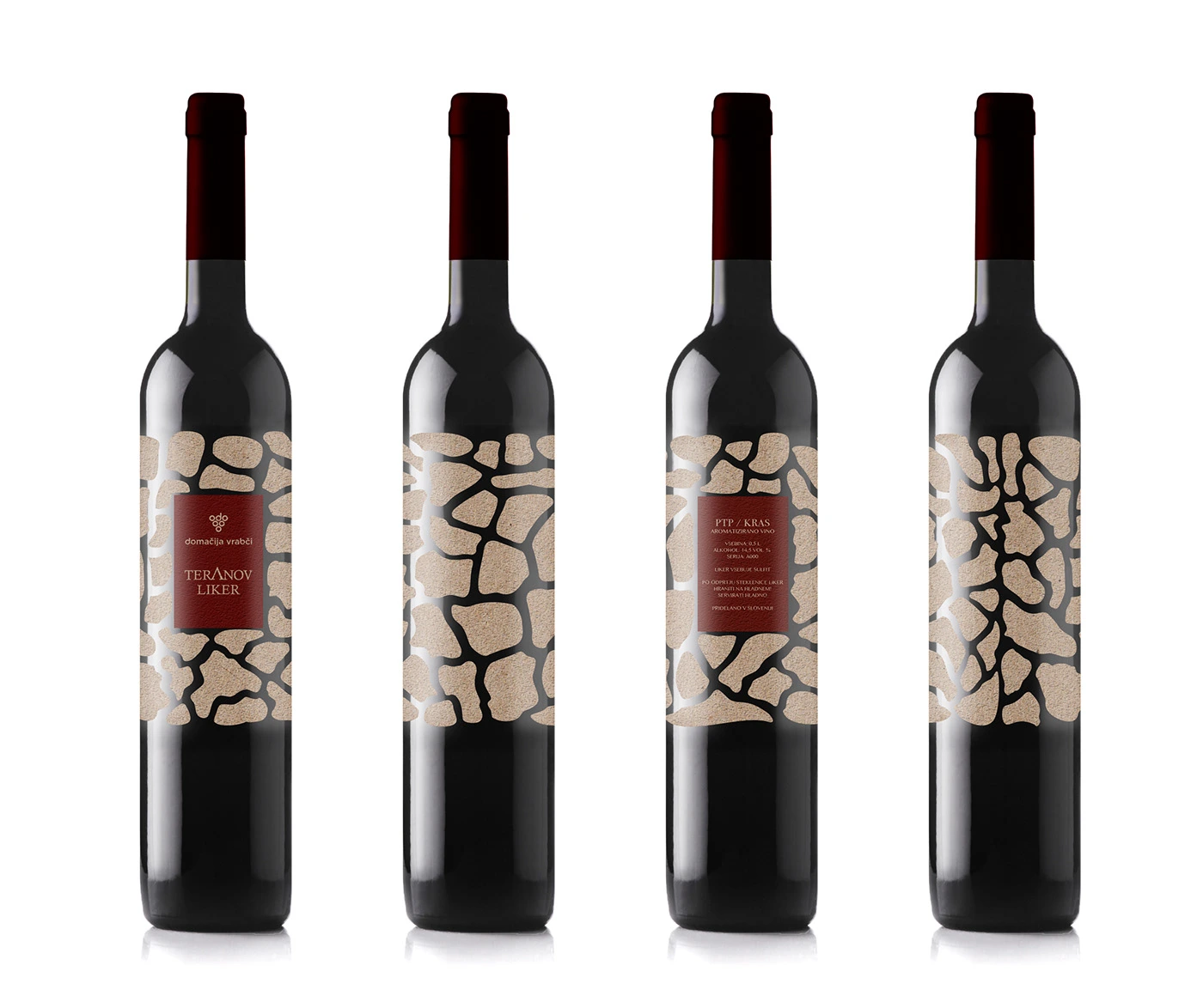
Packaging · LabelIndependent · 2016
Wine & Spirits Labels
A label is typography on a cylinder: what looks balanced flat is off by the time it is on the bottle.
Wine & Spirits LabelsThe brief
Independent producers who needed labels that would earn a look on a crowded shelf and still say, legibly and legally, everything a bottle has to say.
The move
I design labels flat but approve them wrapped. Each one starts from the producer's own story rather than the category's visual habits, and the type is set so the front panel still reads when the bottle is turned twenty degrees.
The detail
Substrate does half the work. Uncoated and textured stocks change how ink sits and how much a small size can carry, so paper is chosen before the type is finalised, not after.
Bottle on shelf · 3:2Label flat artwork · 3:2Label detail on the curve · 4:5 · macroProduction notes
- Wrapped mock-ups on the real bottle before approval
- Legal copy set to required minimum sizes
- Substrate and finish chosen with the printer
- Press checks attended