Superulearner
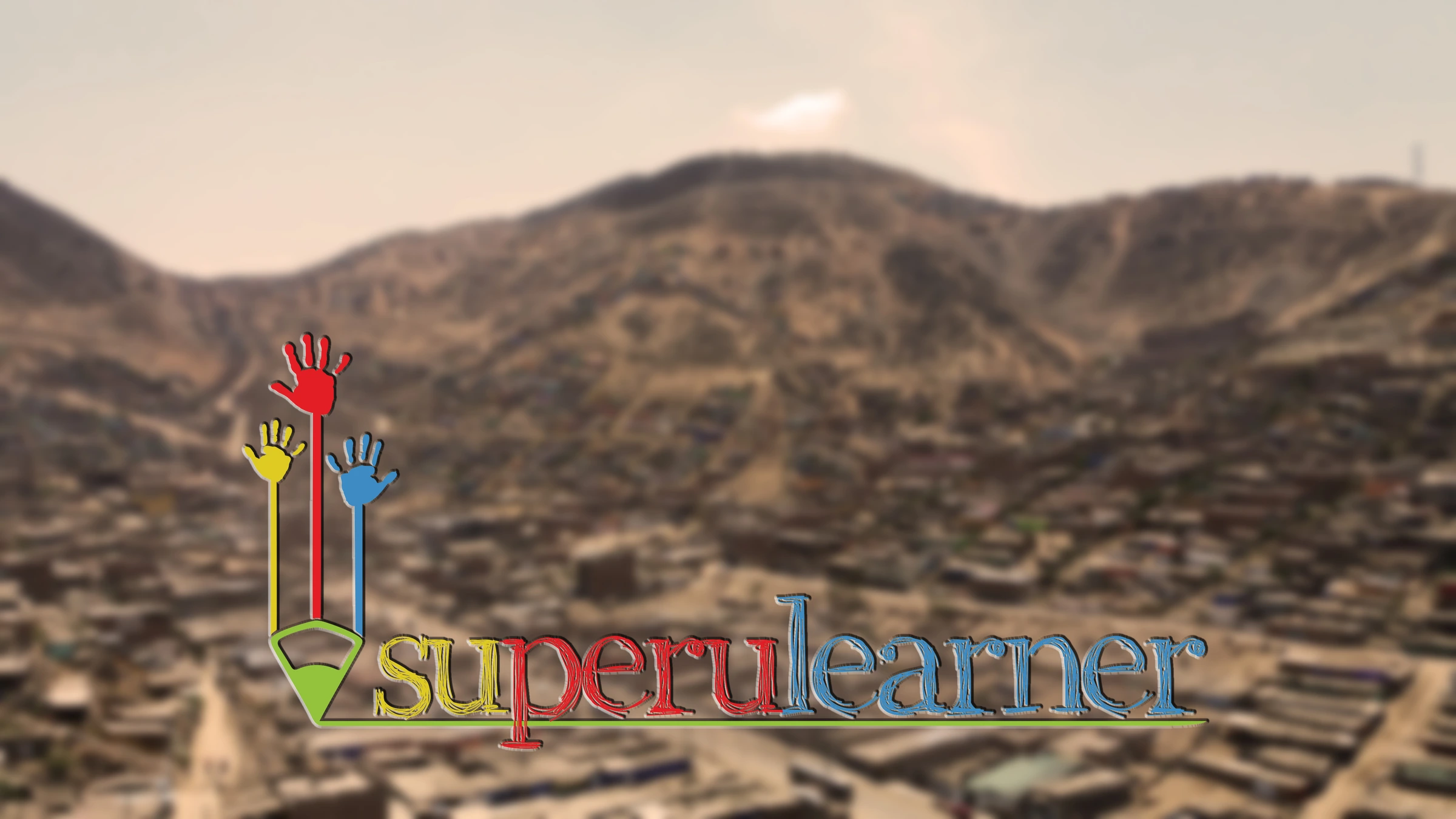
The country was already inside the name: su-PERU-learner. Once you see it, you cannot unsee it.
 Superulearner
The brief
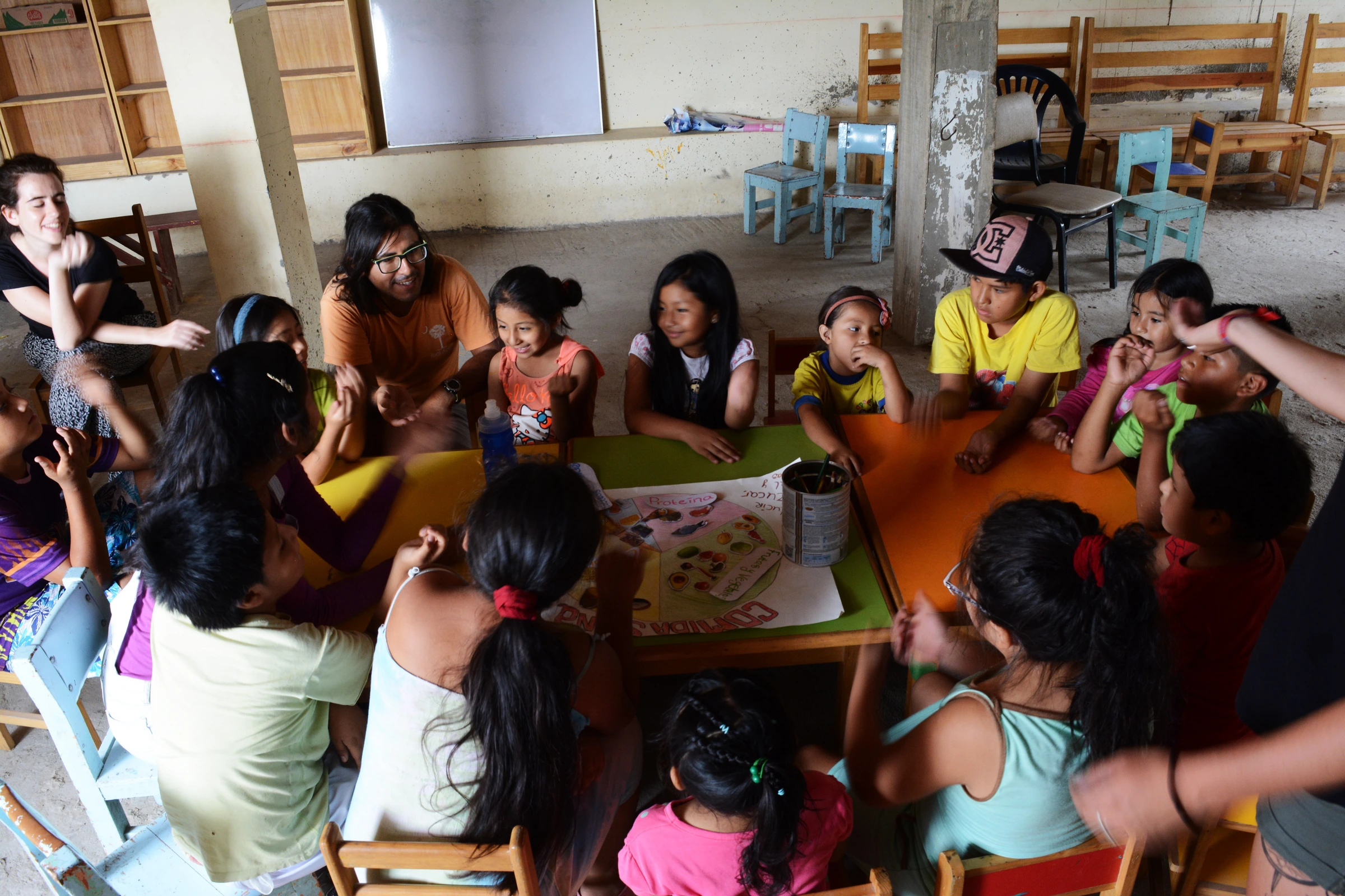
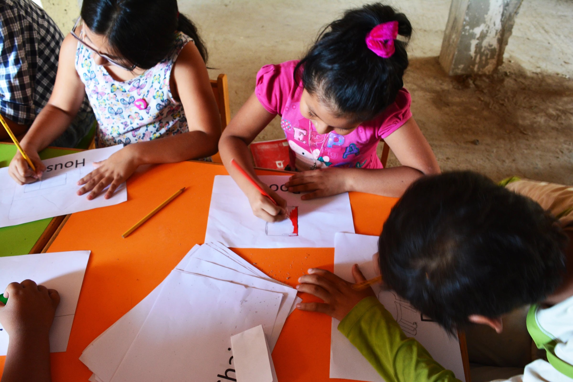
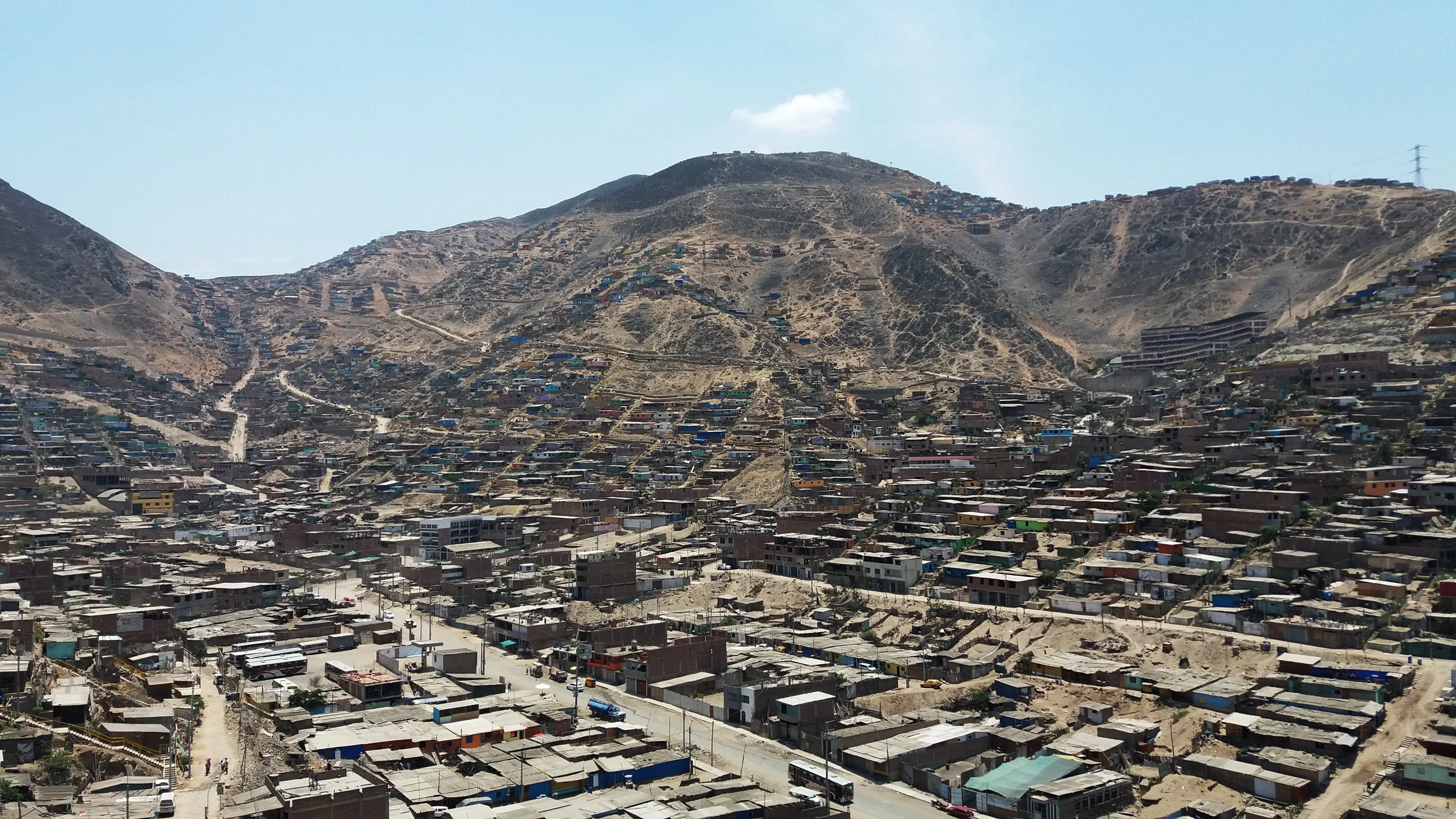
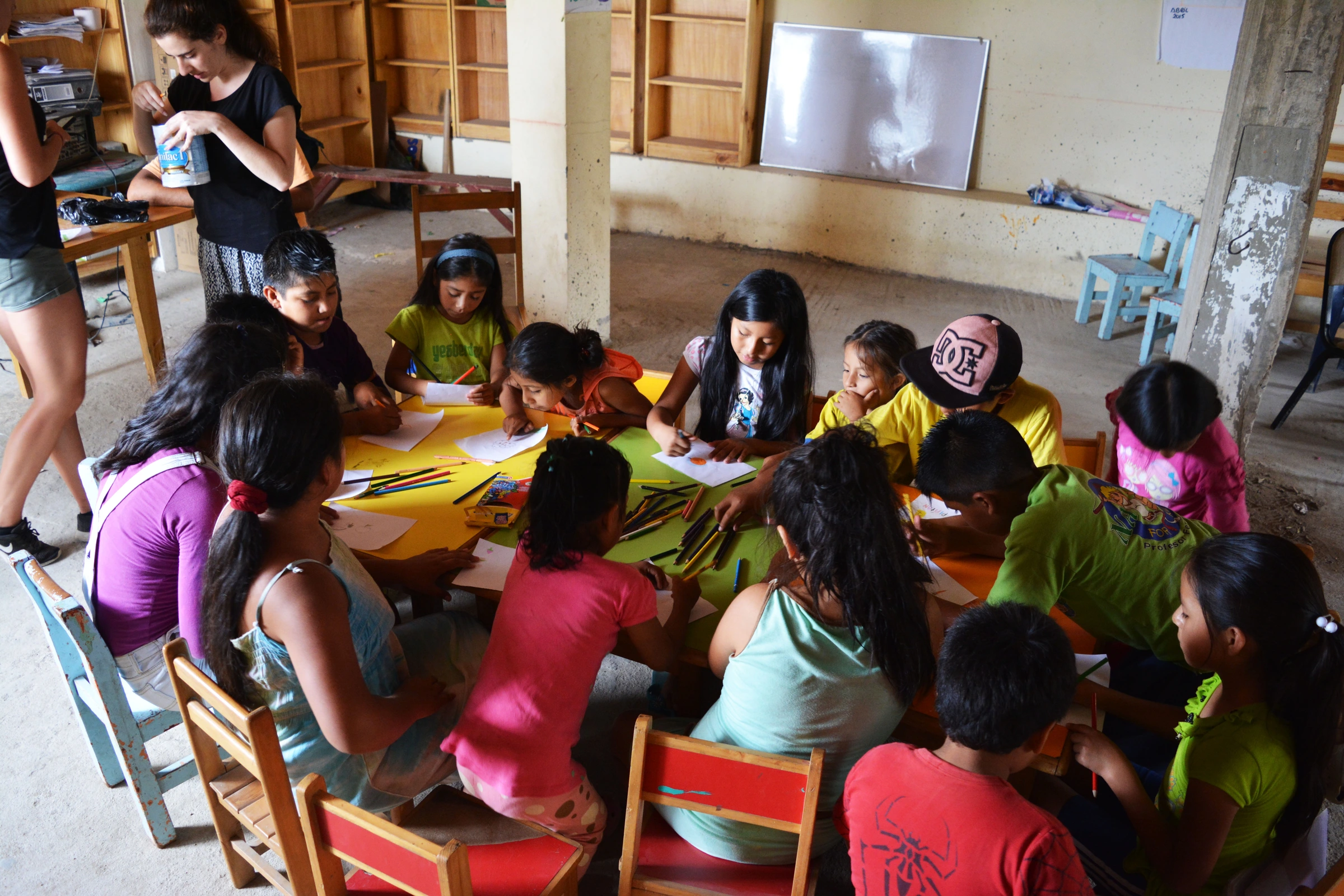
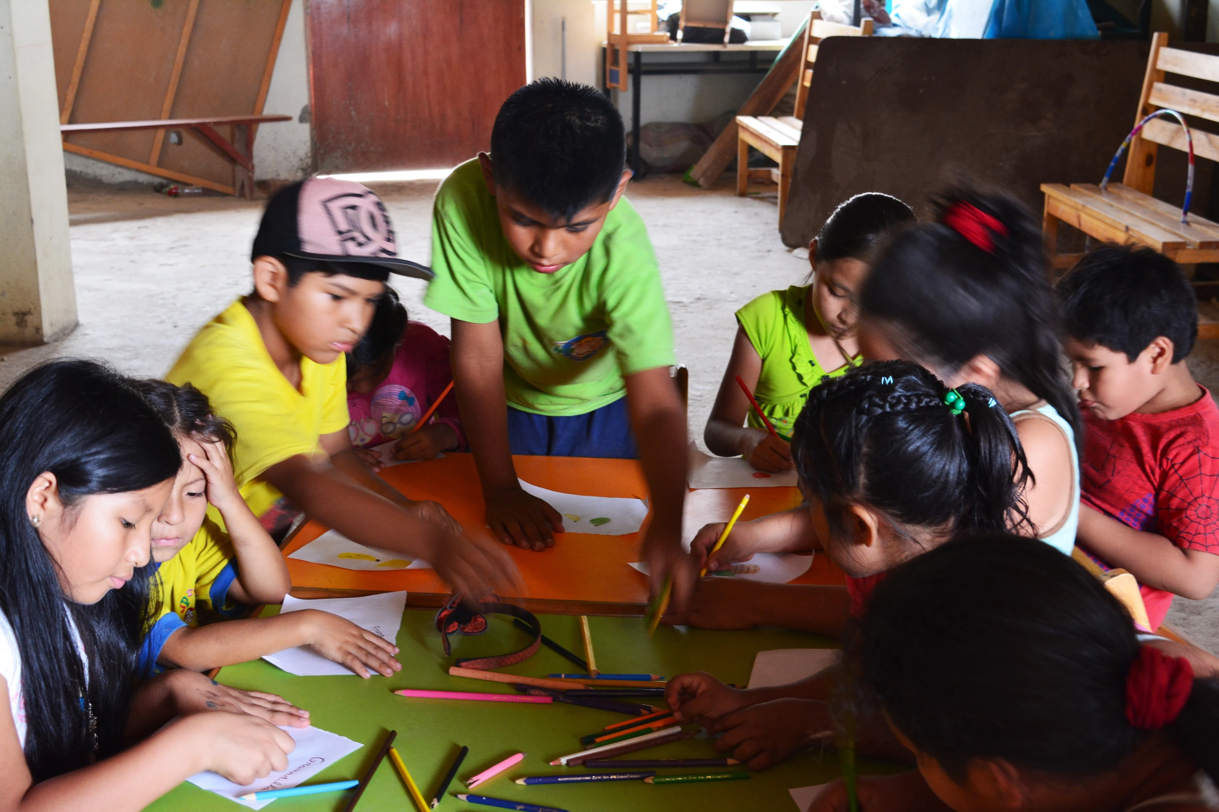
Superlearner Peru runs after-school tutoring, language lessons and creative activities for children in Pamplona Alta, the settlement on the sand hills above Lima. It needed an identity and had no budget for one. I was there volunteering, so I took it on.
The move
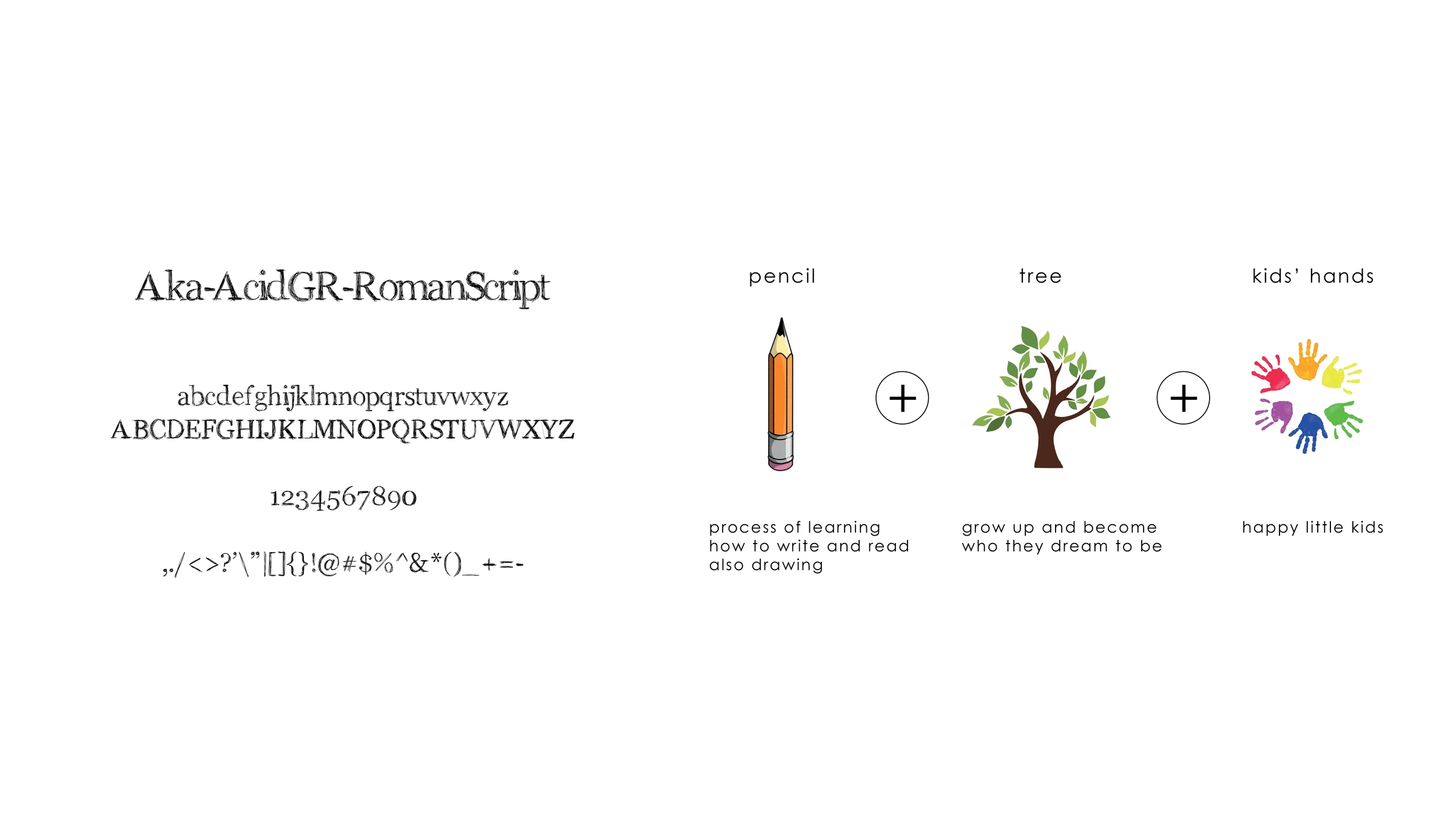
The name gave itself away. Superlearner Peru is long, and PERU is already sitting inside the word super — so I closed it up into Superulearner and used colour to pull the three words apart again, with PERU in the red of the flag. The mark stacks the project's three goals into one drawing: a pencil for learning, a tree for growing into what you wanted to be, and small raised hands for the making and playing the rest of it runs on.
The detail
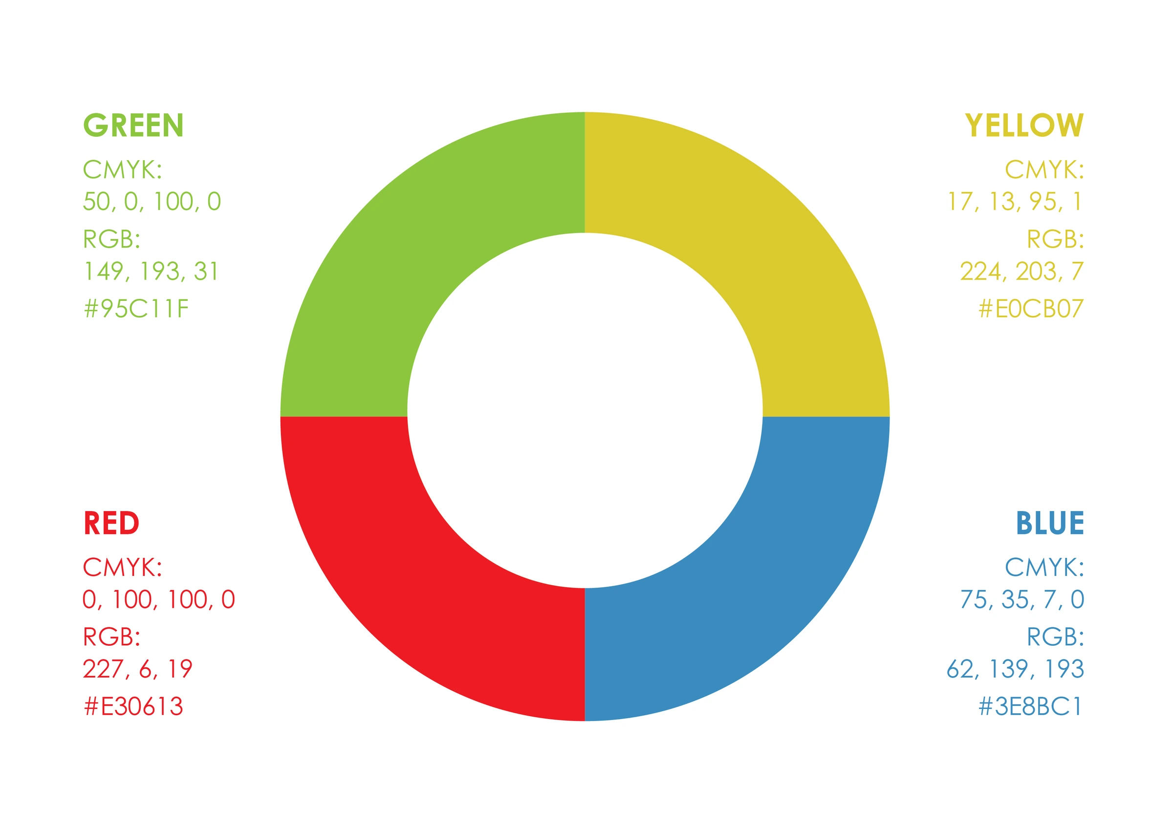
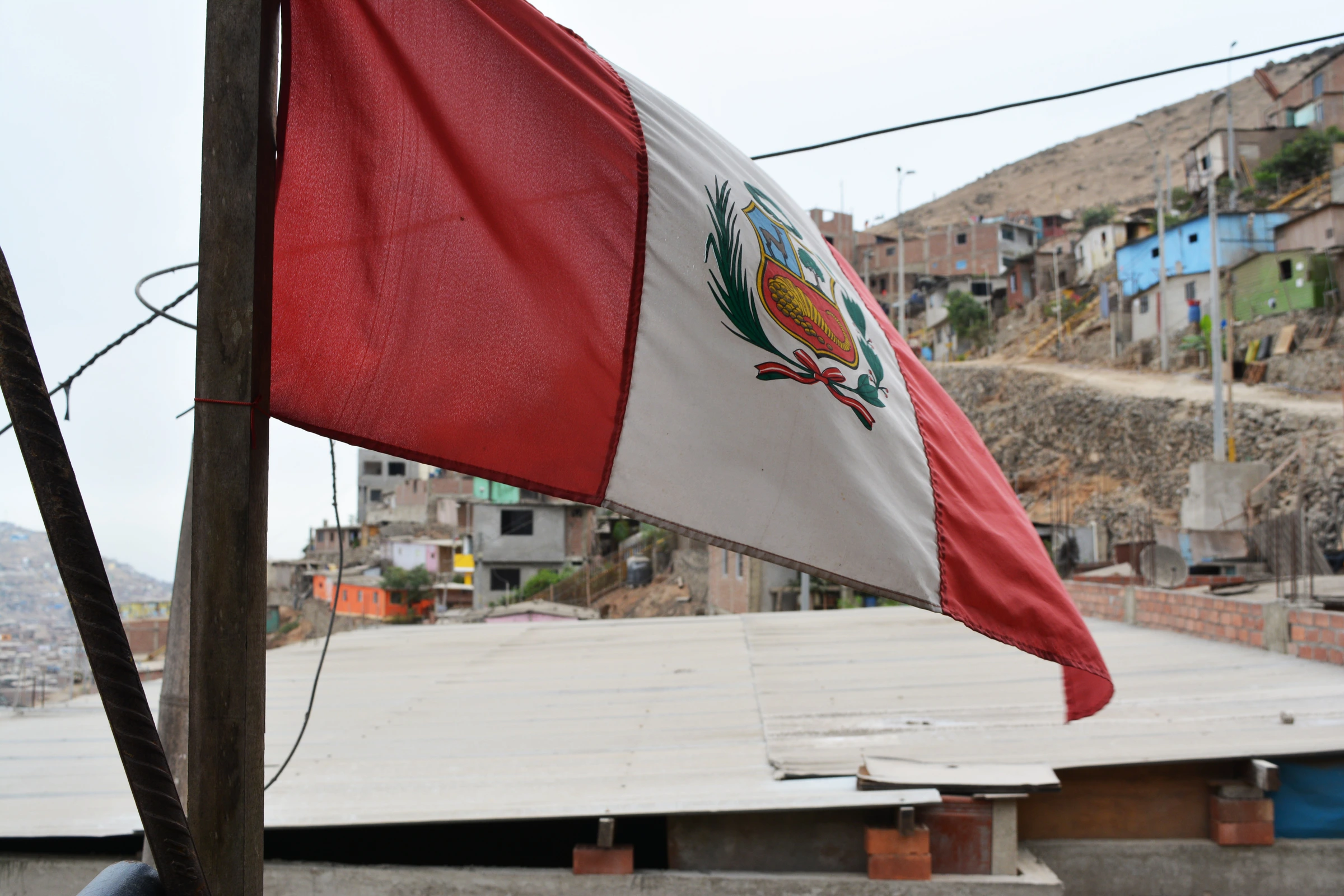
The palette is the one children reach for first — green, yellow, red and blue — and here it is structural rather than decorative: without the colour change, the closed-up name cannot be read at all. Red is not a free choice either. It is the colour of the flag, and that is what makes the hidden PERU land as a discovery instead of a typo.

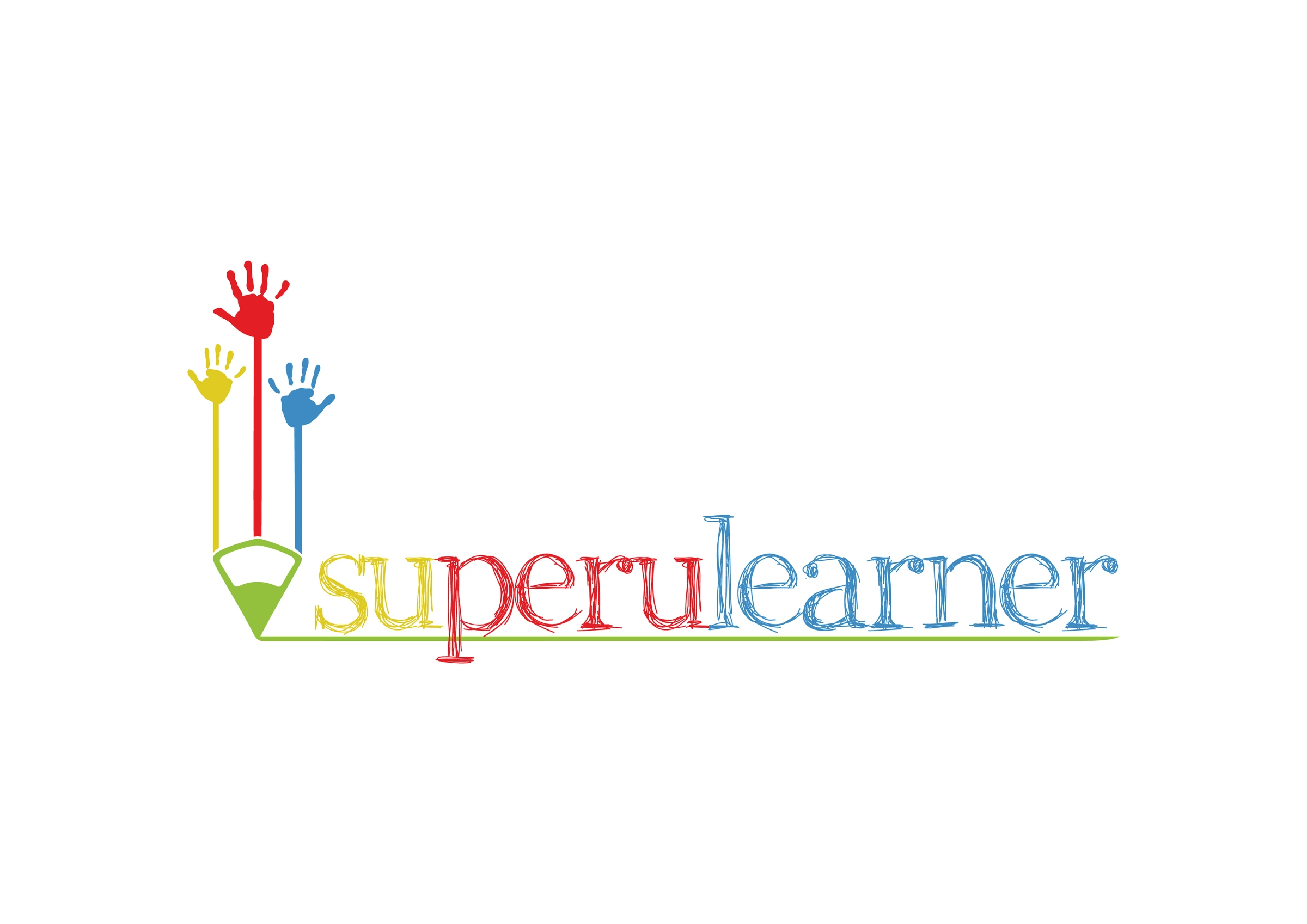
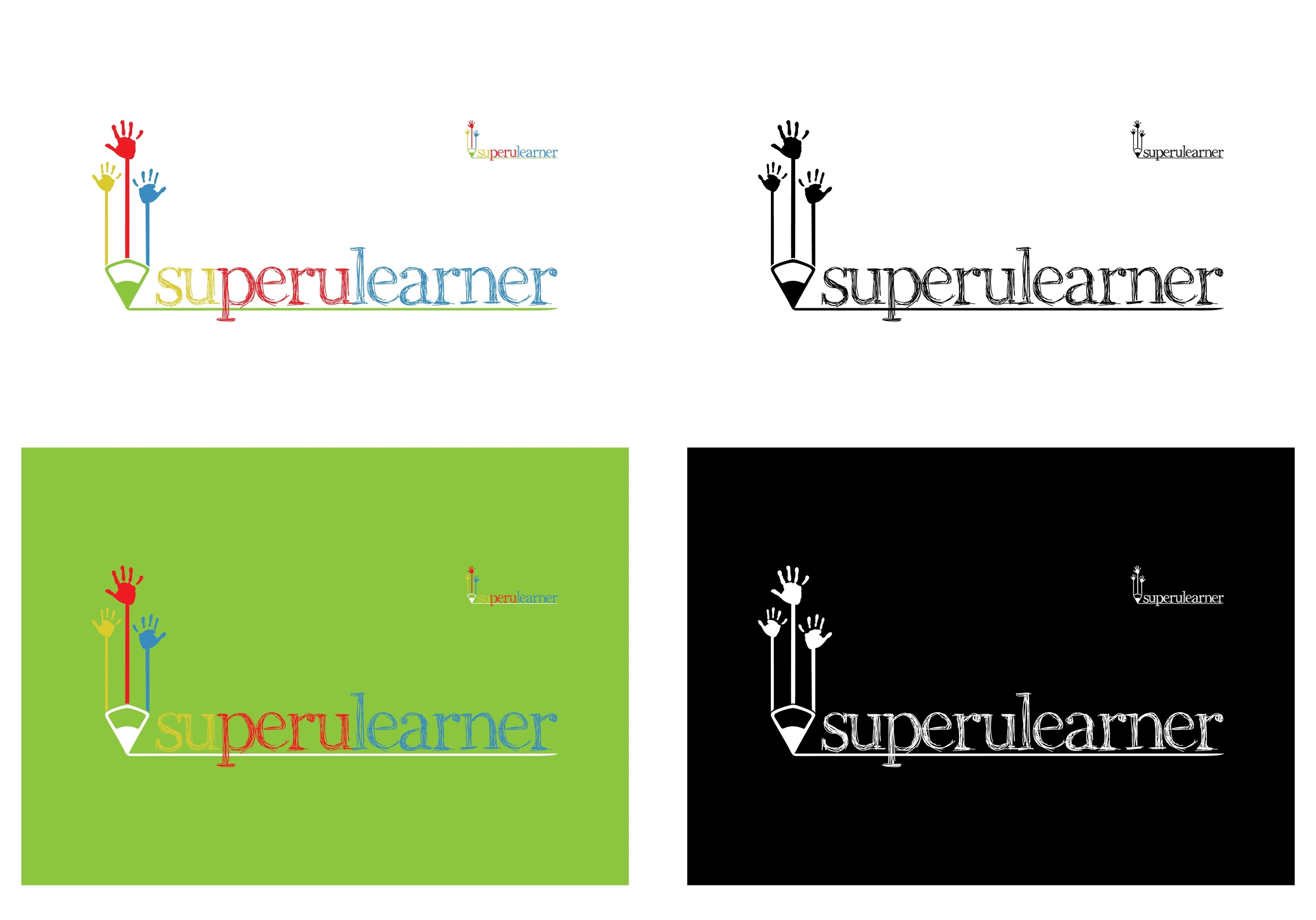
- Naming — Superlearner Peru closed up into Superulearner
- Colour used to separate the words, with PERU in flag red
- Mark uniting pencil, tree and raised hands for the three goals
- Logotype, variants, colour system and applications