VolNepal
A volunteer organisation has no budget for a rebrand and every reason to need one, so the mark had to work in one colour, at any size, in the hands of whoever happened to be posting that week.
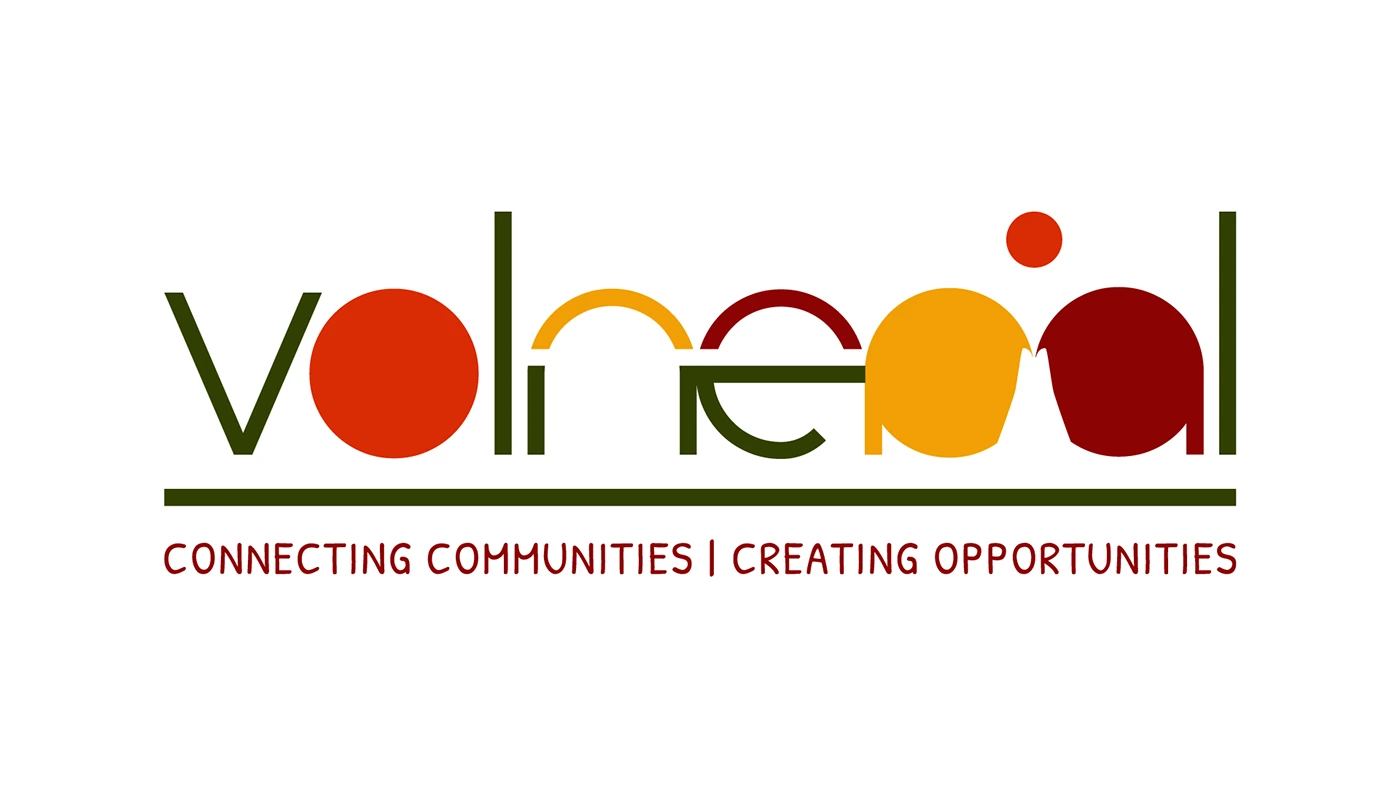 VolNepal
The brief
VolNepal connects volunteers with communities in Nepal. The rebrand was done remotely and pro bono, for an organisation run entirely by volunteers — which meant the identity had to survive being applied by people who are not designers.
The move
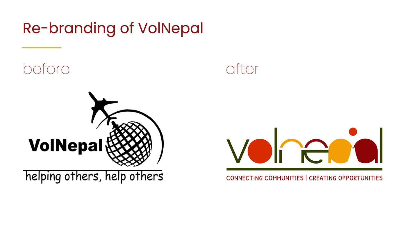
The wordmark is drawn as overlapping shapes in four colours, each letter half typography and half flat form, so the logo carries the colour system on its own — with the line connecting communities · creating opportunities locked underneath it.
The detail
Four colours, no gradients, no effects. It had to reproduce on a printed shirt, a phone screenshot and a black-and-white handout without anyone needing the original file.
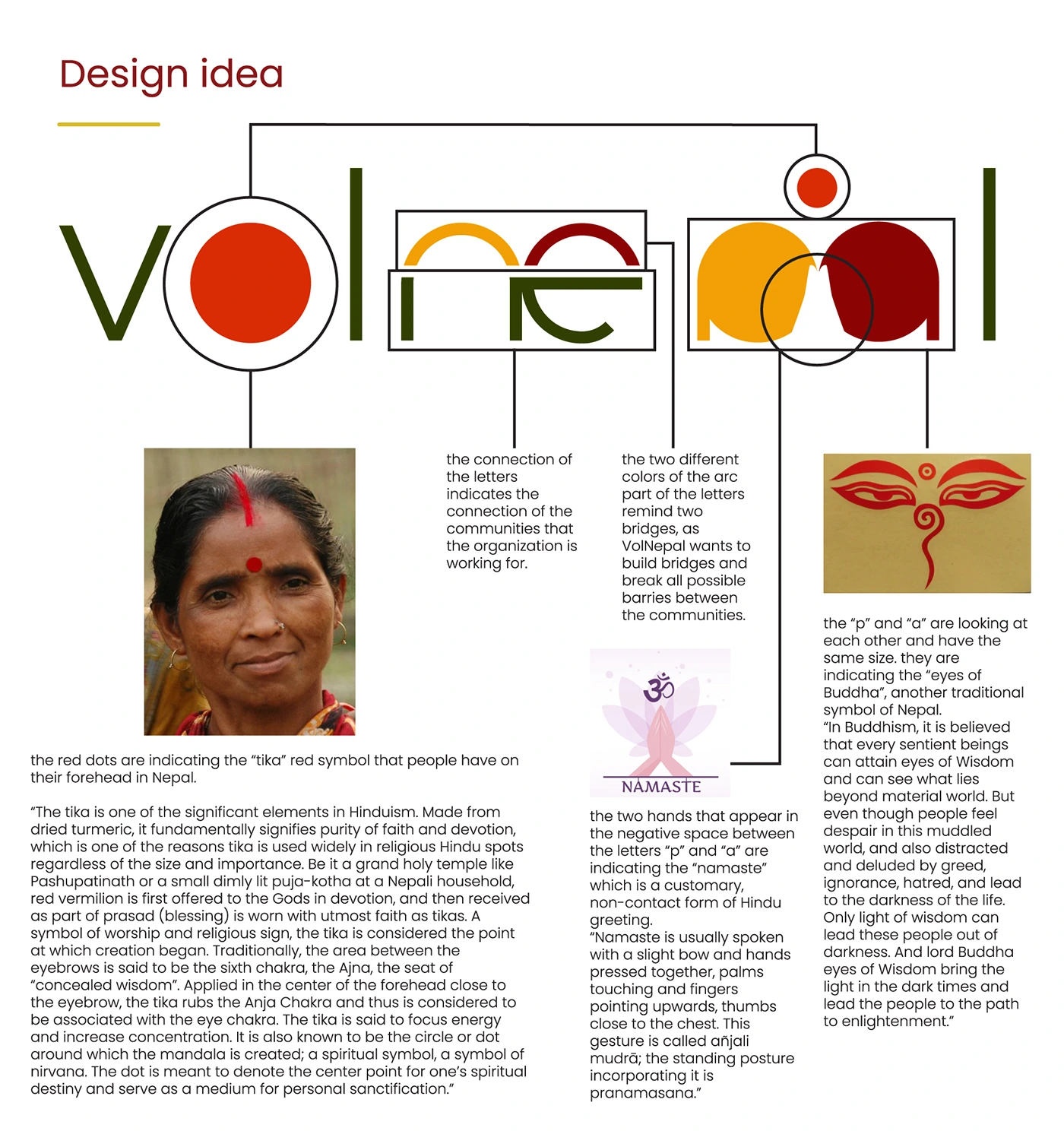
- Wordmark drawn in Illustrator, with a one-colour version
- Four-colour palette with print and screen values
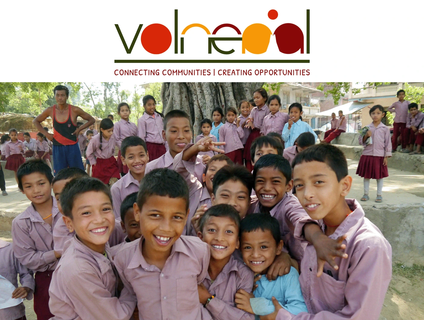
- Logo applications for social and print
- Files handed over with usage notes