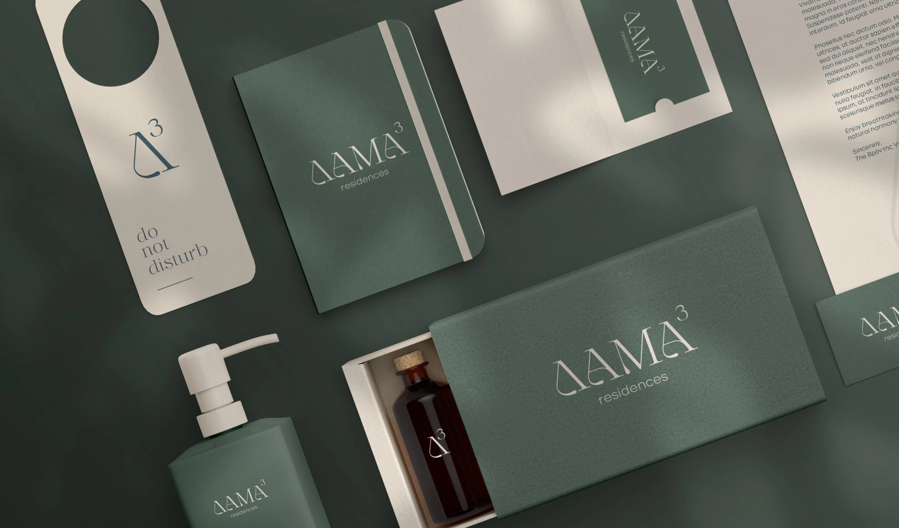
DAMA³ Residences
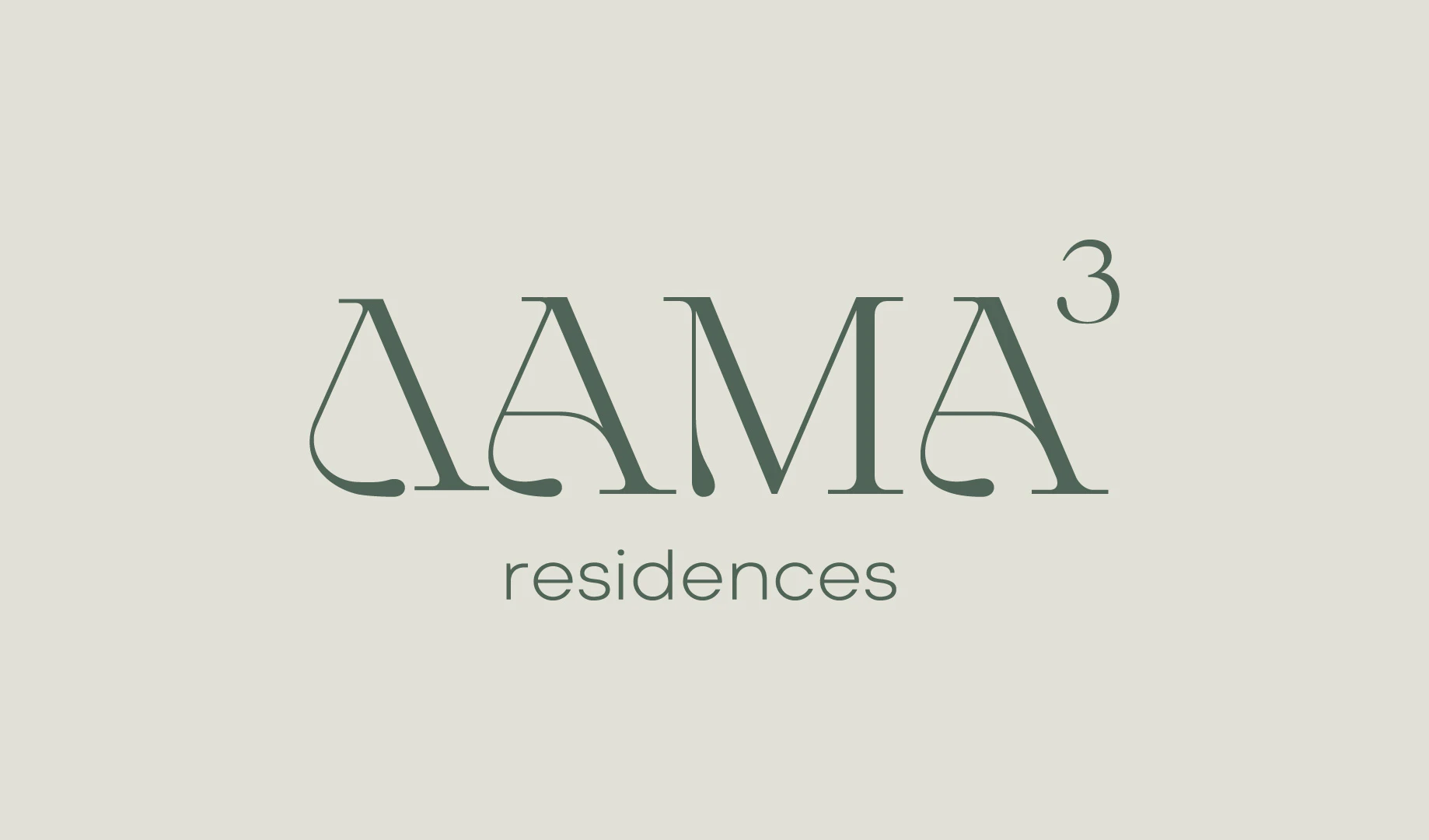
Damatria already holds a three: dama, and tria. So I wrote the name as ΔΑΜΑ³, dama to the power of three, and the little number turned out to hold much more than the name.
At a glance
An identity for summer houses in an olive grove, built from the green of the trees and the beige of the stone. The houses are still being built, so what you see here is the identity, ready for the day they open.
The brief
A&M were designing two summer houses for two brothers, on a plot their family has held for a long time, deep in an olive grove that once gave them their olive oil every year. Each home is a main house and a smaller guest house around a shared courtyard, and a path lined with olive trees leads to them from the road. Later, a third house in the same grove, built in 1925 for the brothers’ sister, will be restored too. Alongside the architecture, the project needed an identity of its own: a name, a mark and all the small things a guest holds in their hands, from the key card to the soap by the sink.
The idea
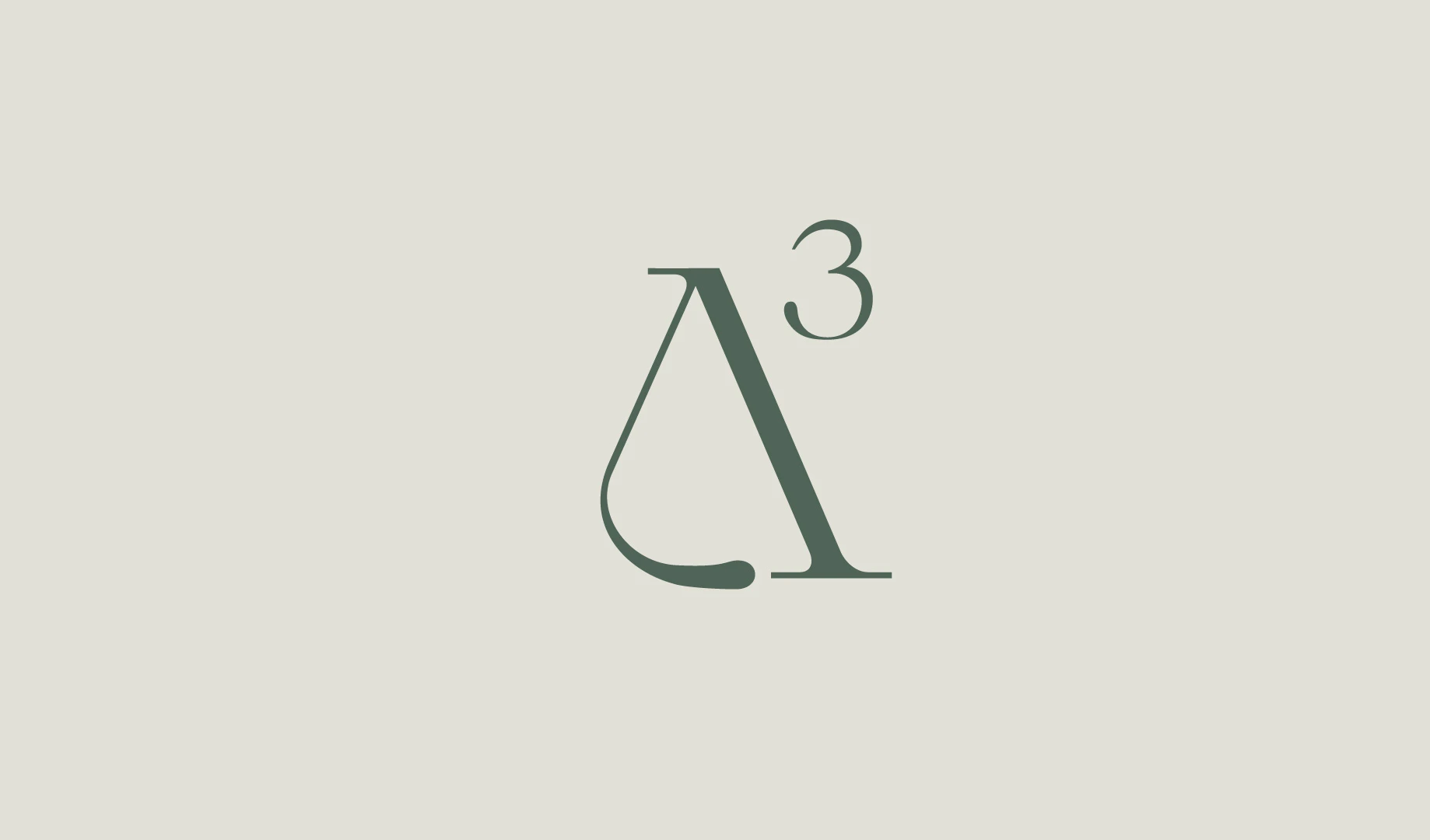
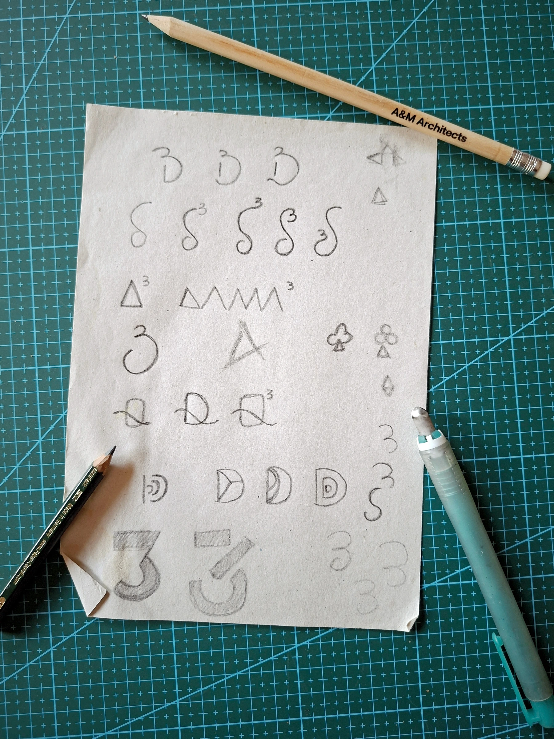
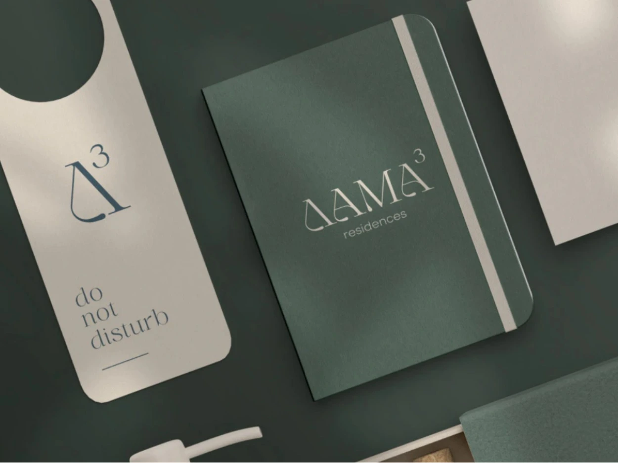
I started with the village. Damatria sounds like dama and tria, three, so I wrote it as ΔΑΜΑ³: dama to the power of three, just as you’d write it in math class. The more I learned about the project, the more that small number made sense: two brothers, their sister and three houses in one grove. The mark became a single Δ with its ³, and I drew the Δ with one soft curve at its foot, so the letter feels gentle. The colors come straight from the place: the deep green of the olive trees and the warm beige of the stone. The architects drew on the old houses of the Dodecanese, with soft, cubic volumes and earthy tones, so I kept the lettering just as calm: an elegant serif for the name and a light sans for “residences.”
Project
- Client
- A&M Architects · private client
- Industry
- Hospitality · real estate
- Services
- Branding
- Role
- Senior graphic designer · brand identity
- Year
- 2025
- Team
- In-house at A&M Architects · identity designed alongside the architects’ project
In numbers
- 3houses in one olive grove
- 2brothers, each with a house and a guest house
- 1925the year the third house was built, to be restored
“It feels like it belongs to the grove, and that was what I was after.”
The detail
Above all, it is calm. On the door hanger, the notebook, the key card and the soap bottle, the mark stays soft and simple, green on stone, stone on green.
Production notes
- 01Brand identity for DAMA³ Residences, Damatria, Karpathos
- 02Name mark, logo, color palette and hospitality applications
- 03Palette taken from the olive grove and the stone of the houses
- 04Designed in-house at A&M Architects, as part of their team
- 05Houses under construction · applications shown as mockups
Since then
The houses are still being built, and the identity is ready for the day they open.
Links
- A&M Architects
- The project
Credits
- Rights
- © A&M Architects AE · Files are presented with the permission of A&M Architects AE