Dob'r Pek Bakery
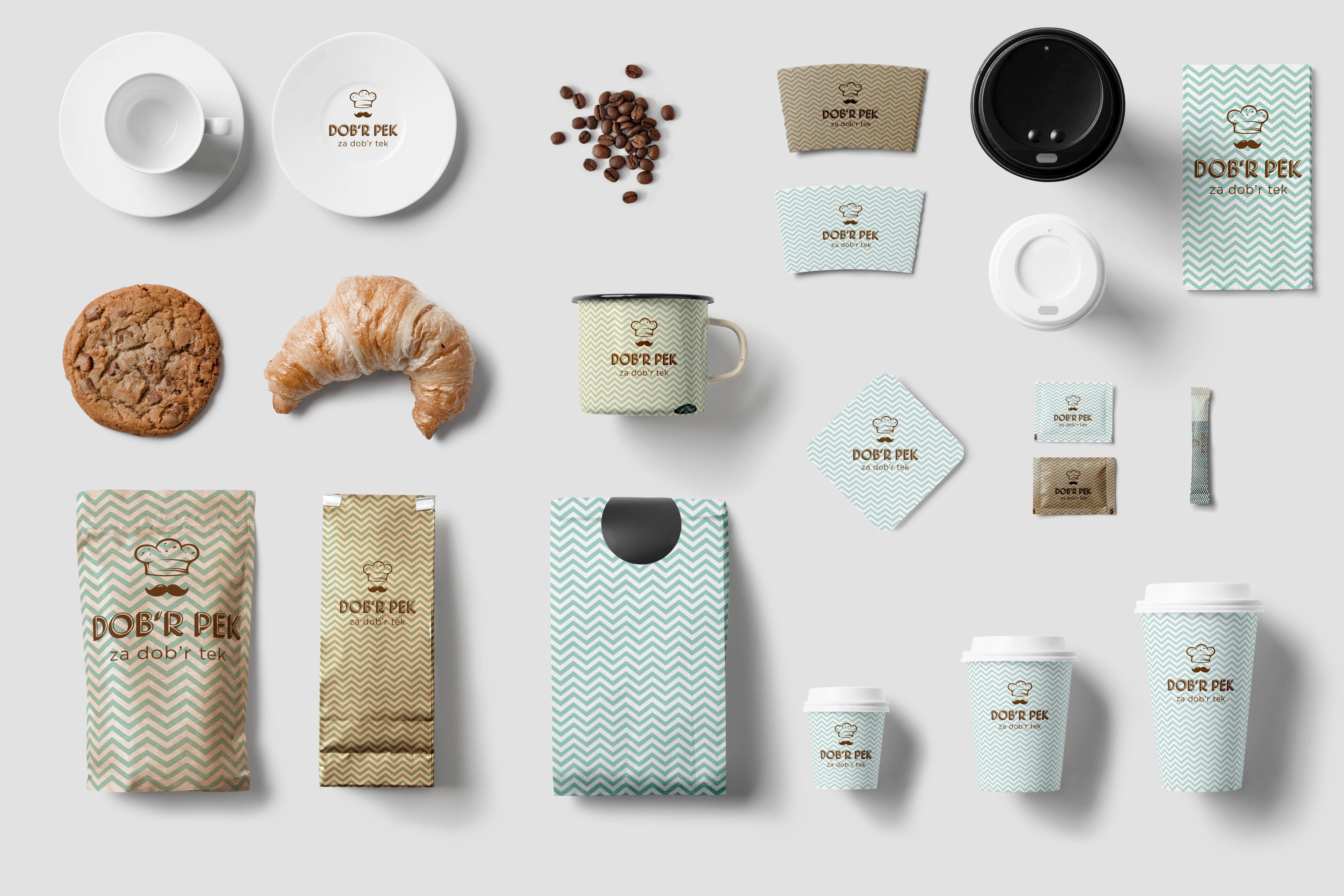
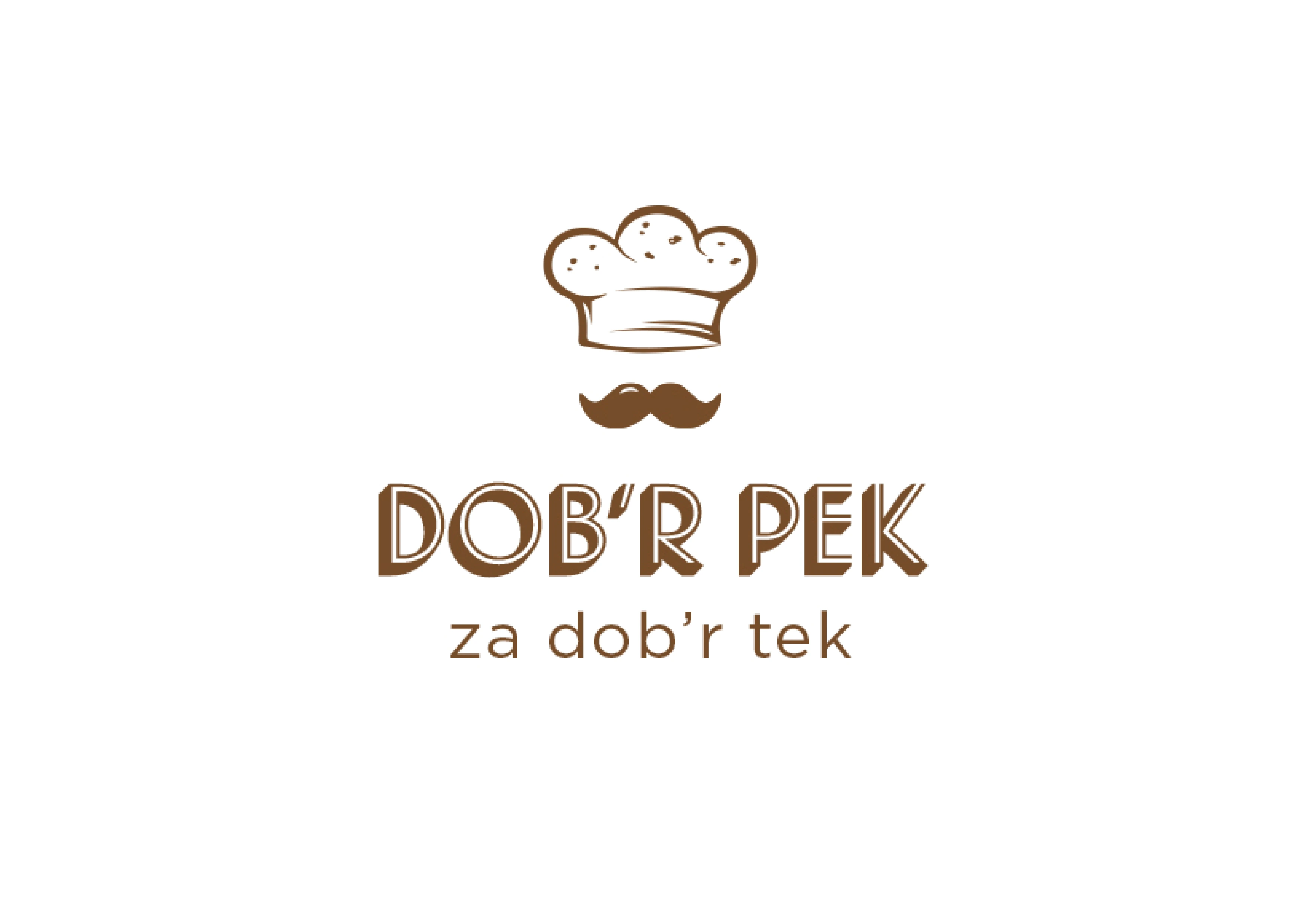
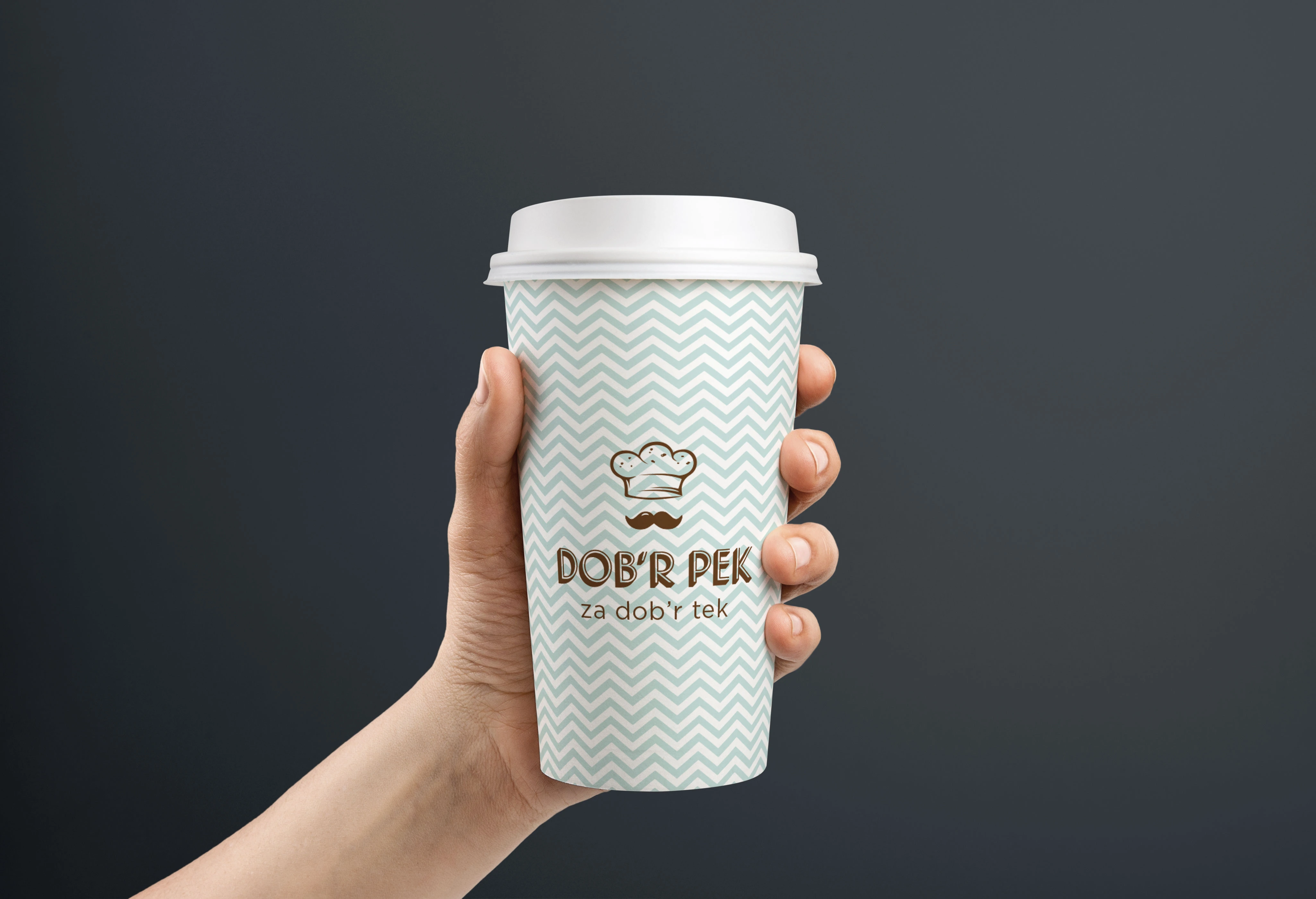
A baker's hat and a moustache drawn as one shape: the old baker who vouches for the bread, on a cup somebody carries out of the door.
 Dob'r Pek Bakery
The brief
A new bakery opening in Ljubljana, selling take-away. Two things had to be true at the same time: that the bread is made the way it has always been made, and that the shop itself is new and easy to walk into. Take-away also means the packaging leaves the building, so the brand had to be recognisable in someone else's hand, at a distance, upside down.
The move
The mark is a baker's hat and a moustache in a single drawing — read from the top it is the hat, read again it is the old baker underneath it. That face does the vouching; everything around it stays modern, so nothing tips over into nostalgia. Then a chevron pattern in mint against brown carries the brand where the mark is too small to read: on the cup, the bag, the wrapper.
The detail
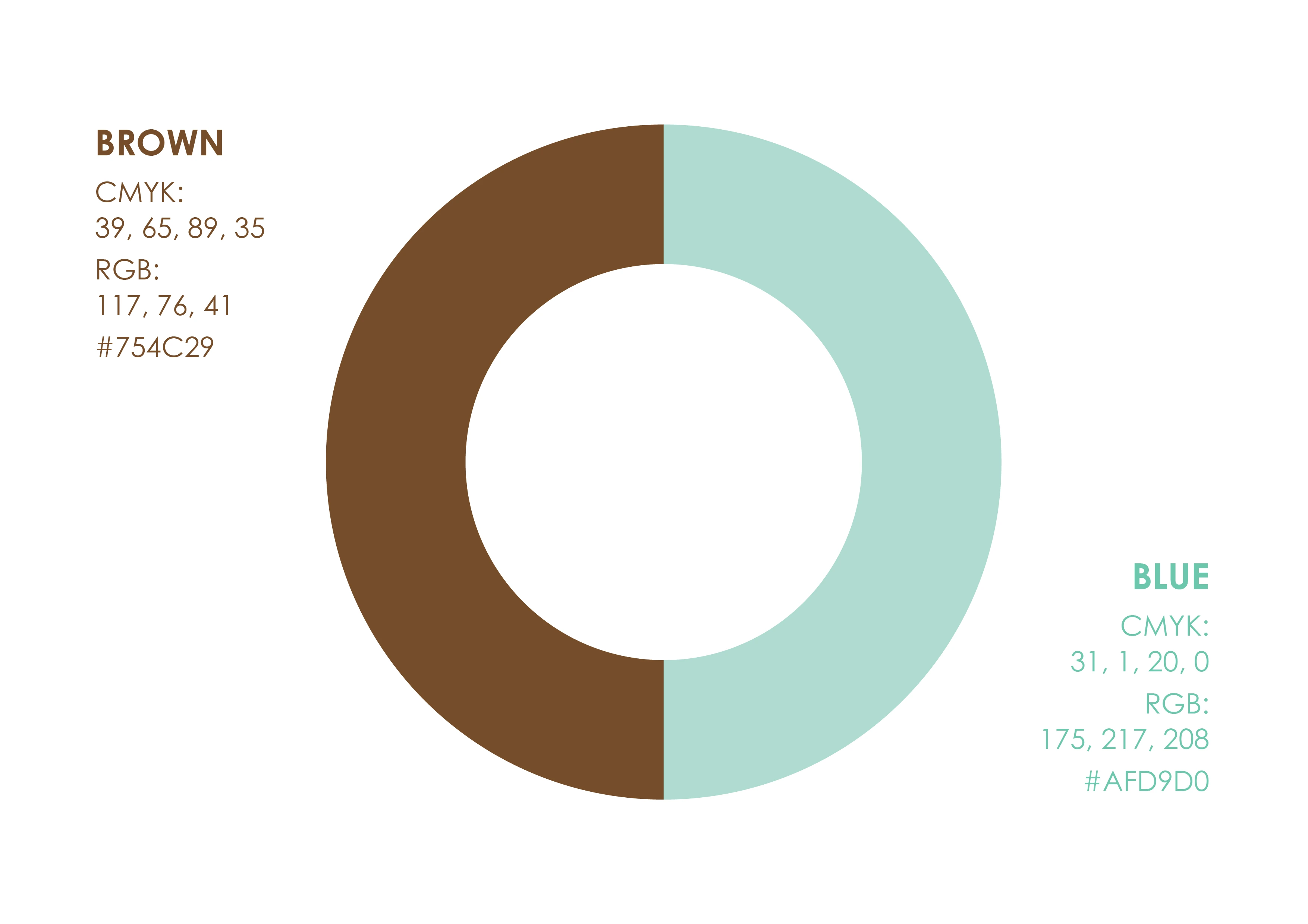
Take-away is the whole constraint. The pattern exists so the identity survives being reduced to a strip of a cup seen across the street, and the two colours were chosen to hold on kraft paper and on white board without building the system twice.
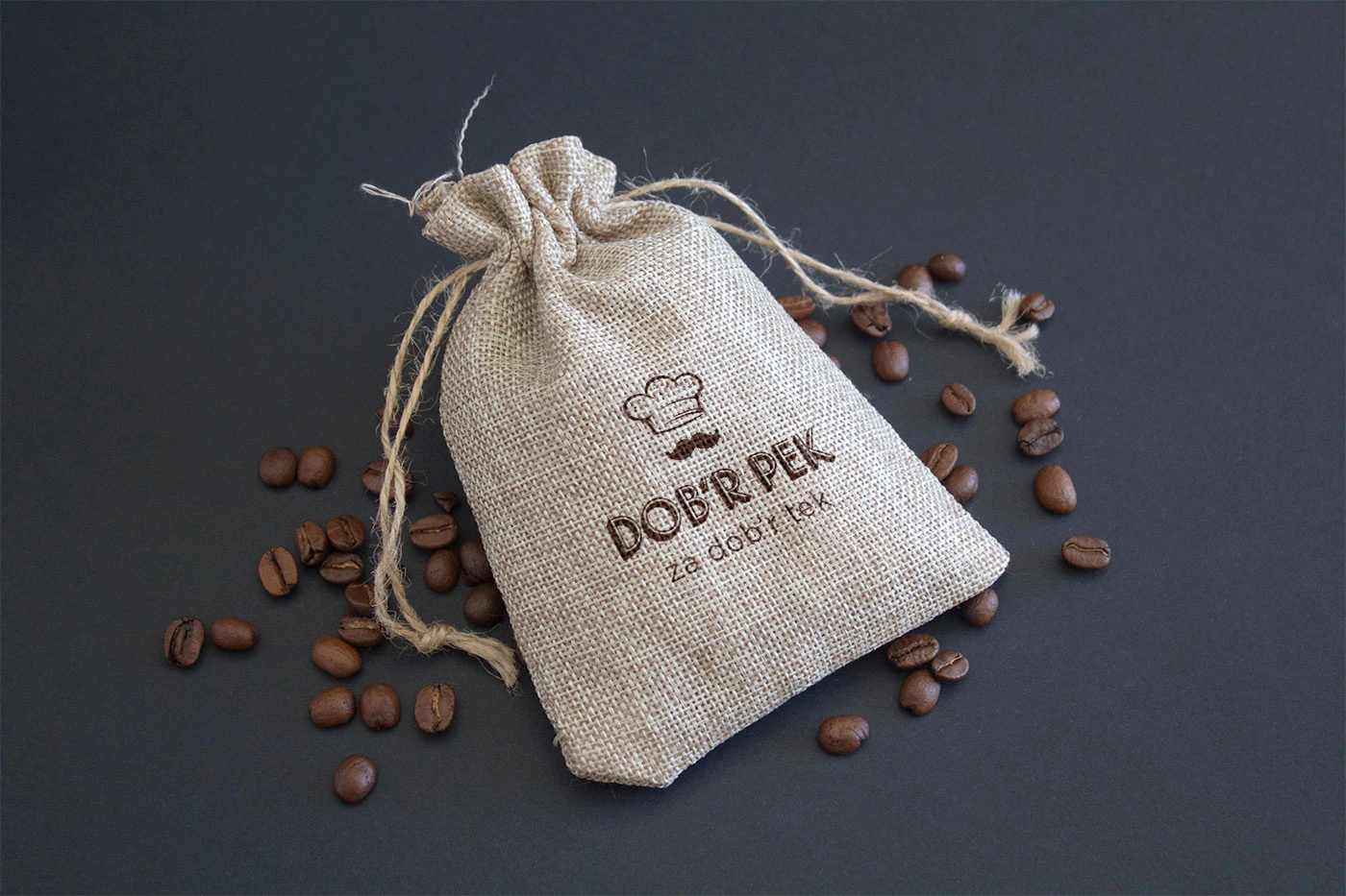
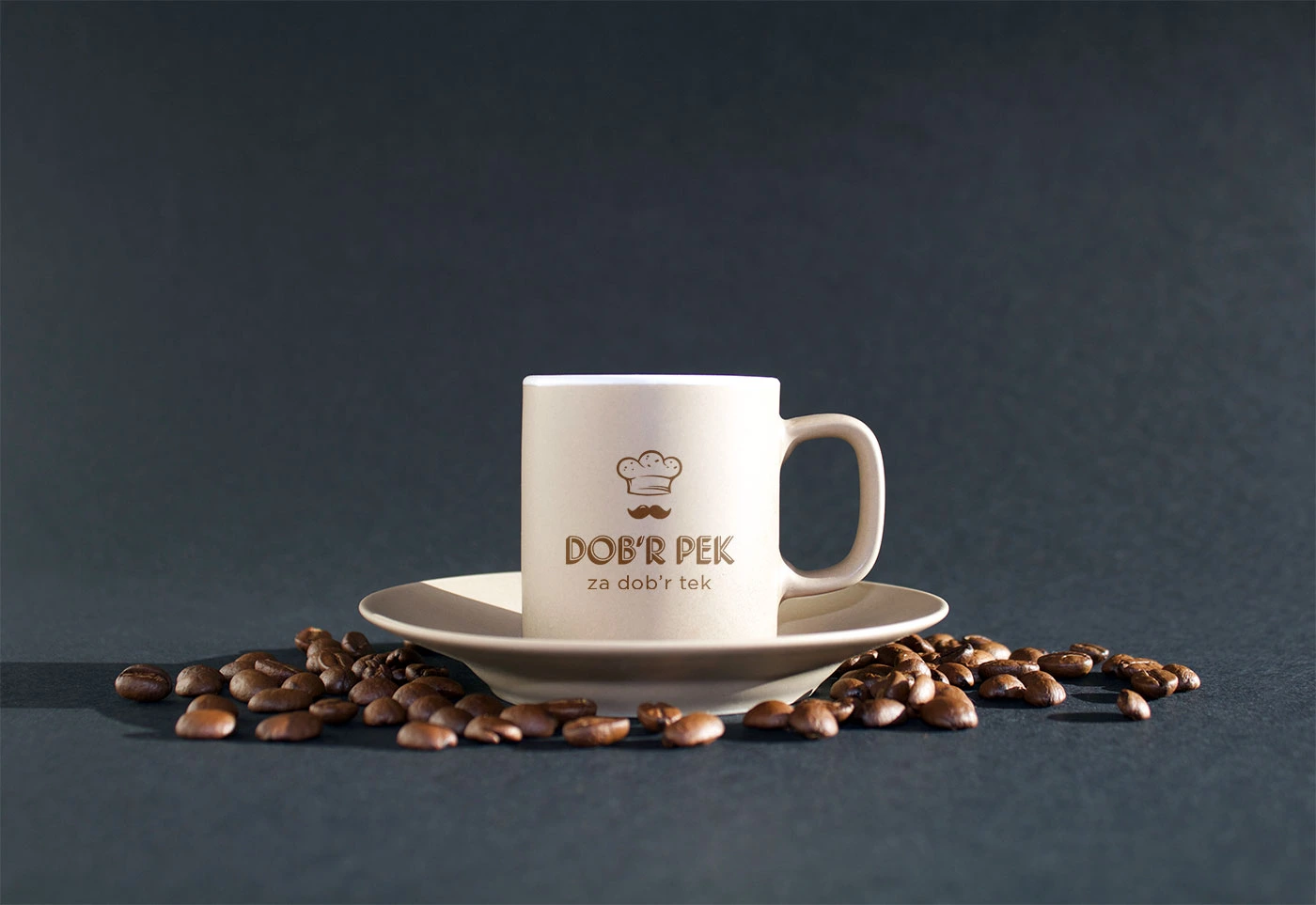
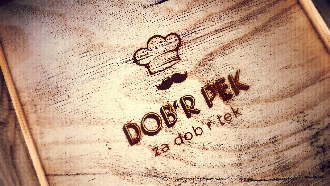
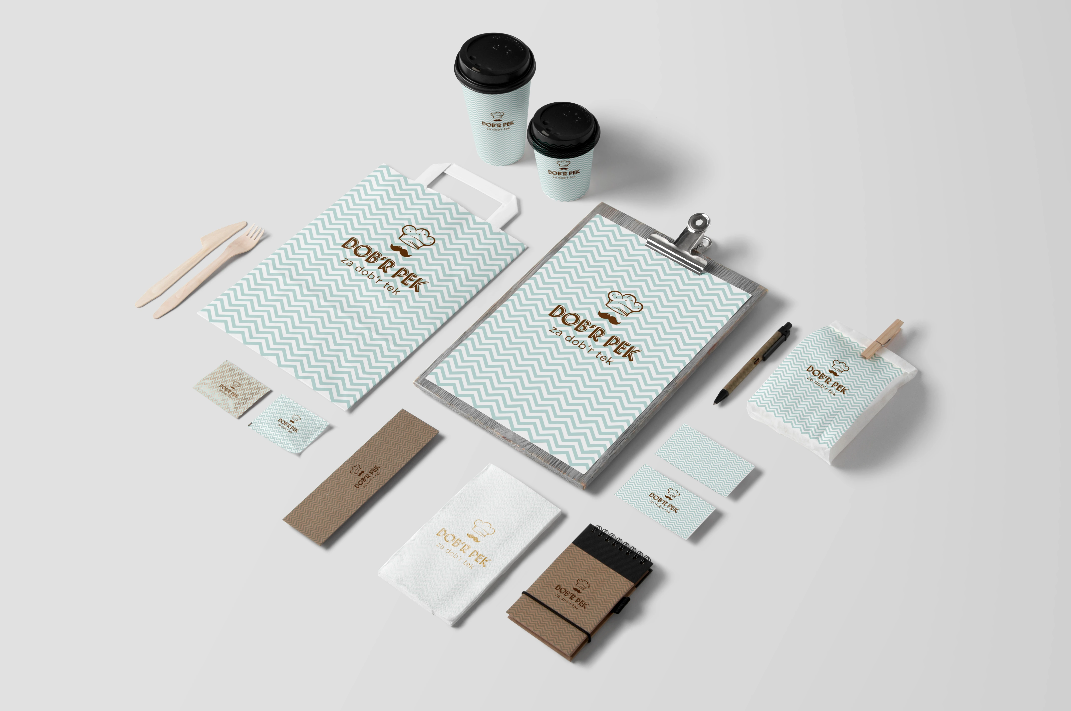
- Mark drawn as hat and moustache in one form
- Two colours, brown and mint, that hold on kraft and on white board
- Chevron pattern for where the mark is too small to read
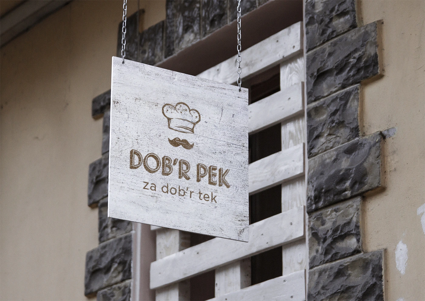
- Cups, bags, wrappers, stationery and a hanging sign