Health Economic Solutions
Two medical symbols hidden inside three letters: a cross where the H meets the E, a serpent in the S with a dot placed for its eye.
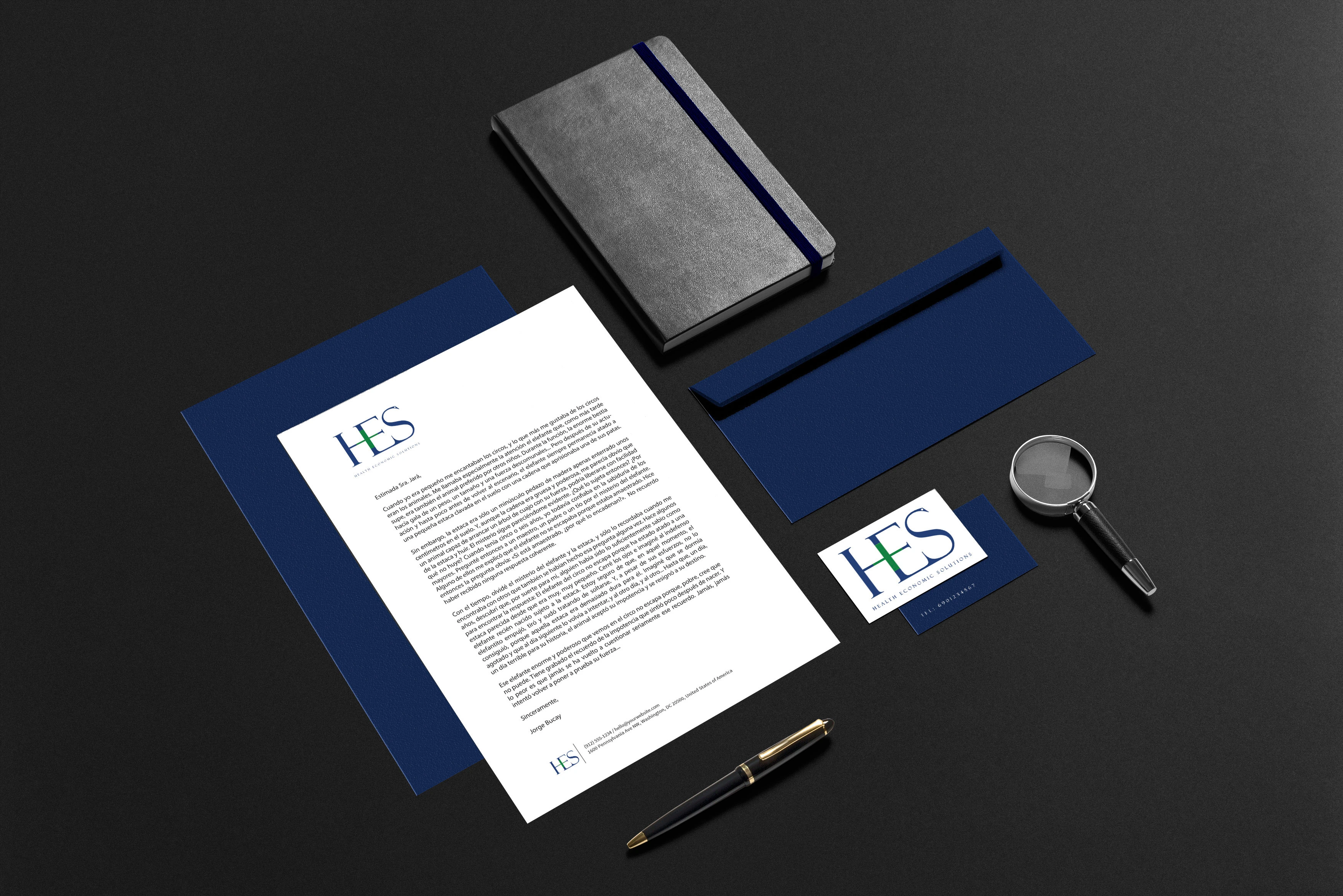 Health Economic Solutions
The brief
Health Economic Solutions advises hospitals, clinics and pharmaceutical companies in Lima — applied economics used to prove what a treatment is actually worth. The audience is payers and boards, so the identity had to carry itself like a professional services firm while saying, immediately, that the subject is health.
The move
I put the medicine inside the letters instead of next to them. The crossbars of the H and the E meet to form the pharmacy cross, drawn in green so it reads as a mark within the word; and the S is the serpent of Asclepius, with a single dot placed for its eye. Both are ancient Greek symbols that need no translation, in Lima or anywhere else — and neither is an icon added on the side: take them out and there is no logotype left.
The detail
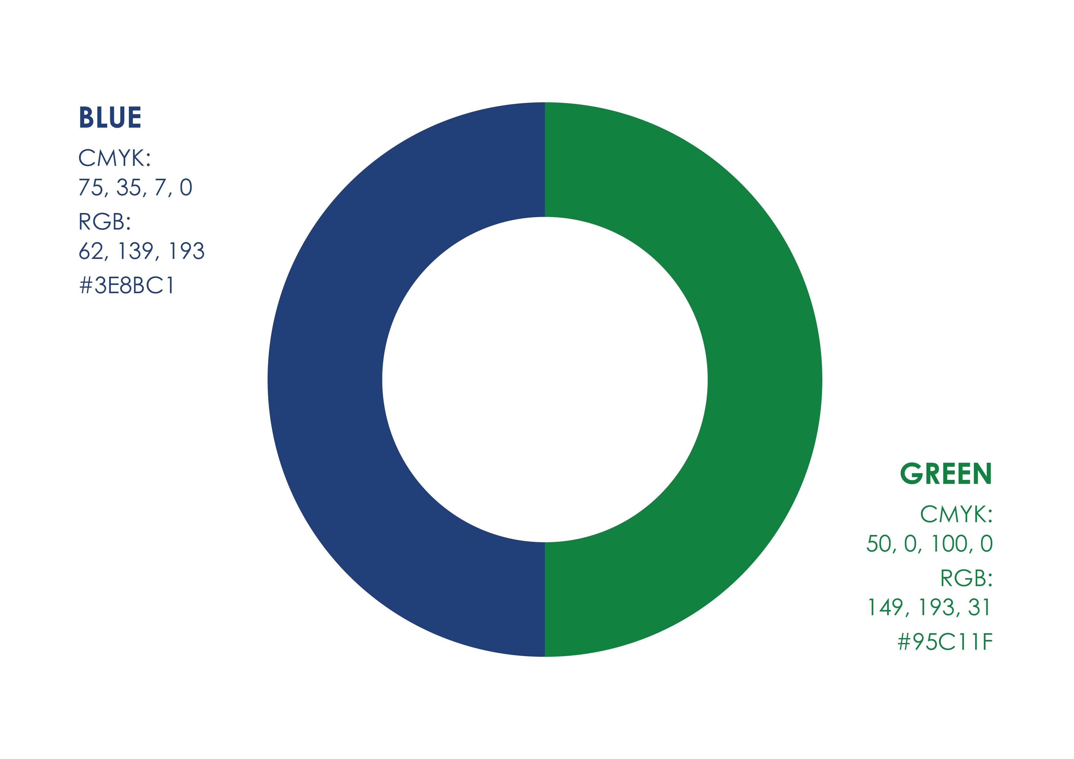
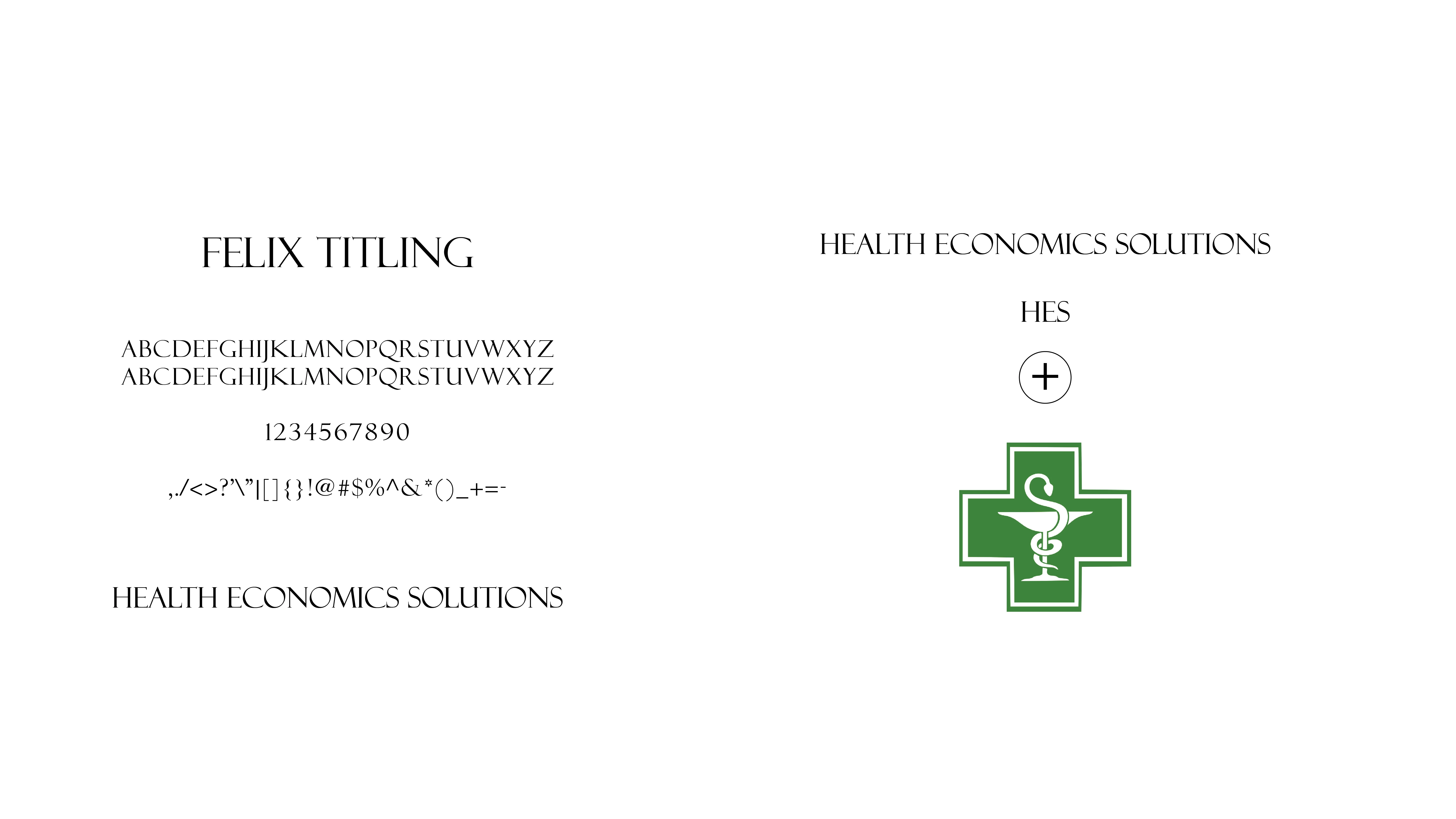
Colour does the rest of the arguing. Deep blue carries the professional half — economics, boards, evidence — and green is the pharmacy half, the colour of the cross above every chemist in the world. Felix Titling keeps the whole thing on the consultancy side of the line, so the health symbolism never turns the firm into a clinic.


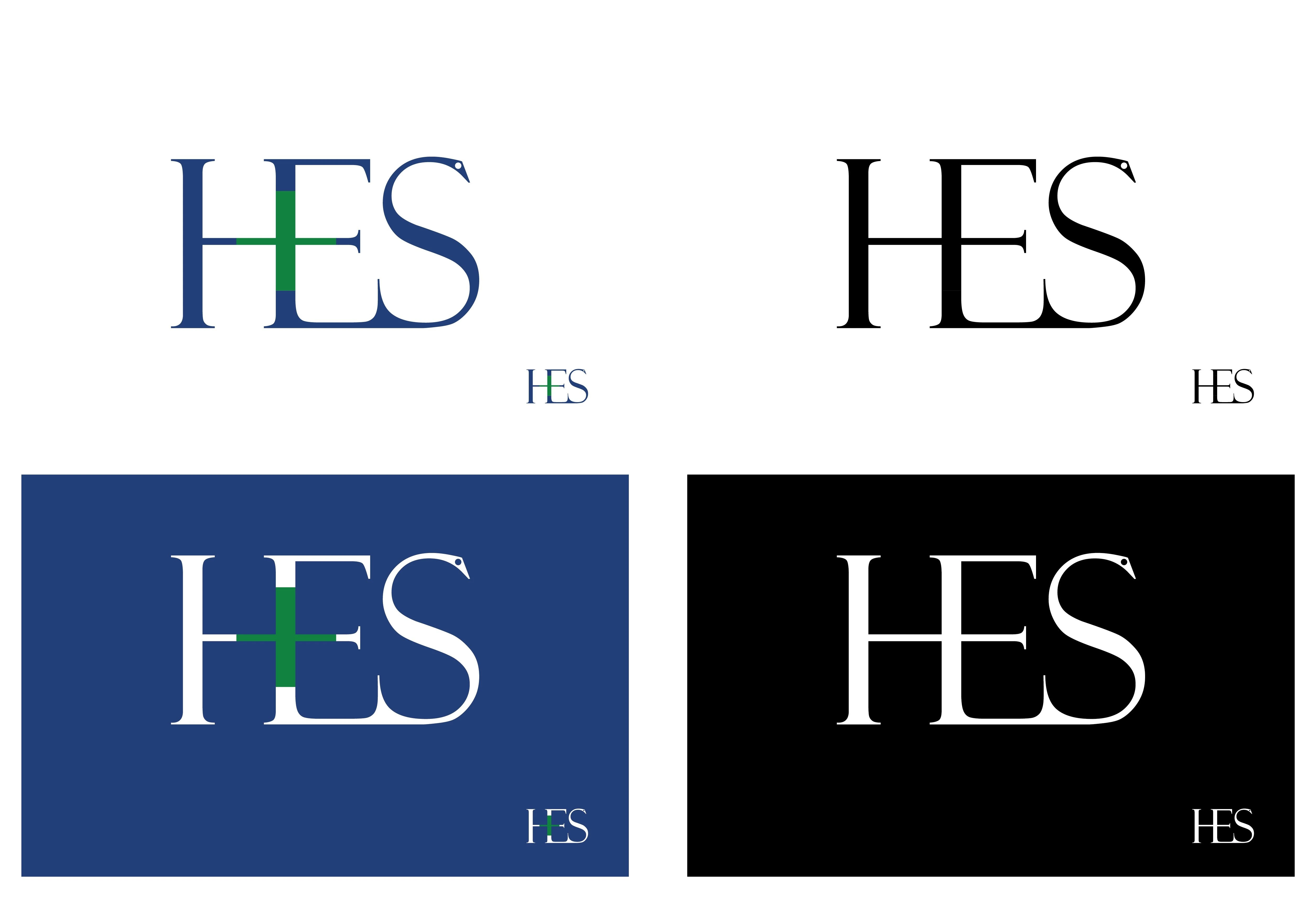
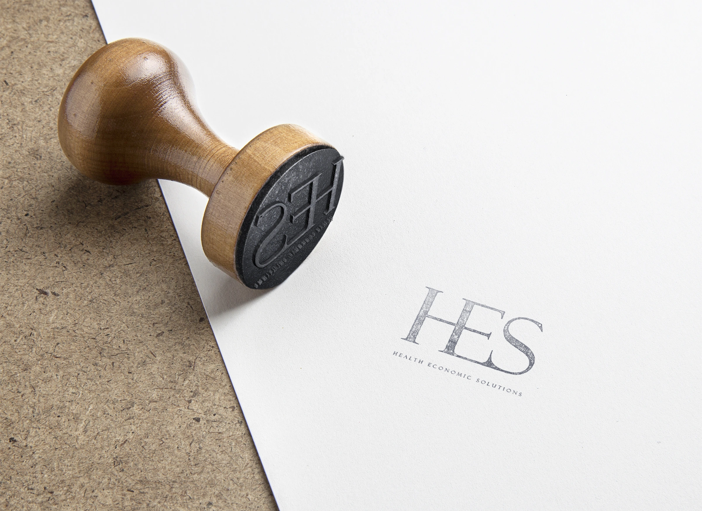
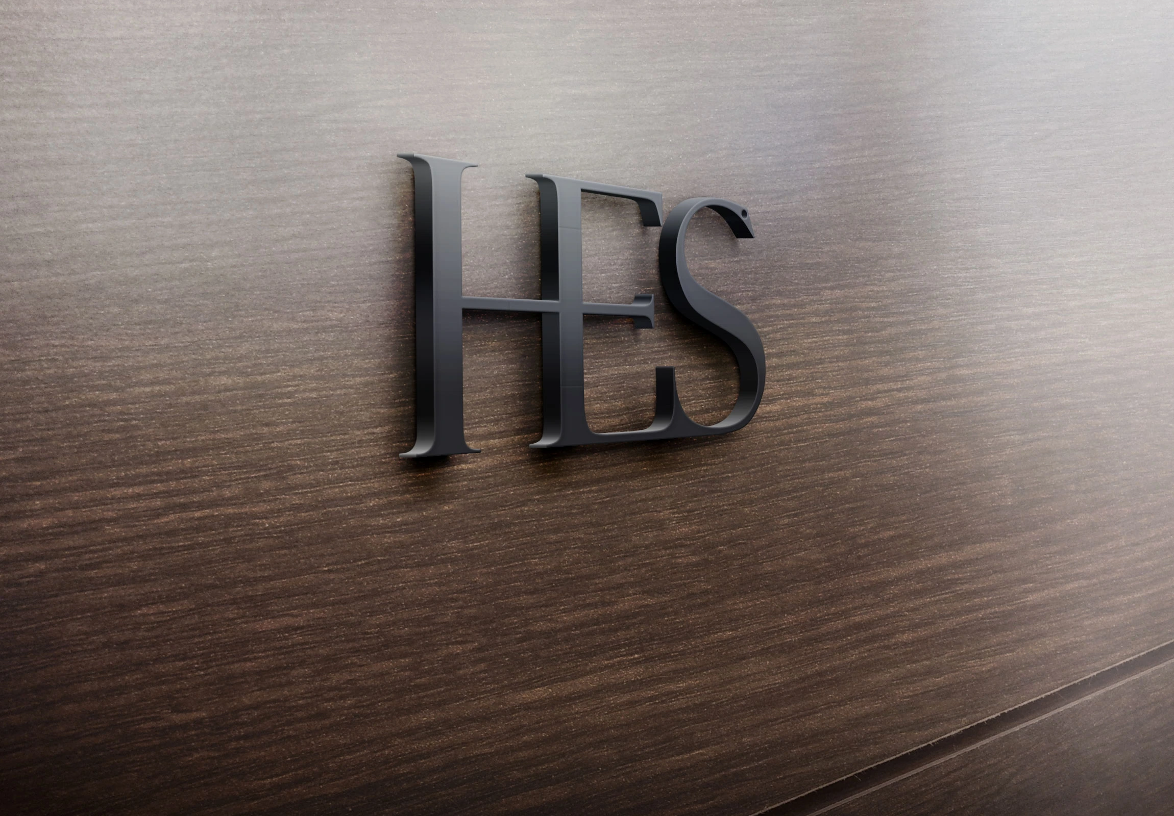

- Mark built inside the letterforms — cross in the H and E, serpent in the S
- Deep blue and green: the professional half and the pharmaceutical one
- Felix Titling as the typographic voice
- Stationery, stamp, signage and embossed applications