Kawacom Tea Catalogue
Six panels for a whole tea list: the folds decide what is seen first, what is read in order, and what has to survive a crease.
 Kawacom Tea Catalogue
The brief
Kawacom needed a catalogue for its loose-leaf teas that could sit on a shop counter and still travel in a bag. The whole range, named and detailed, on a single sheet.
The move
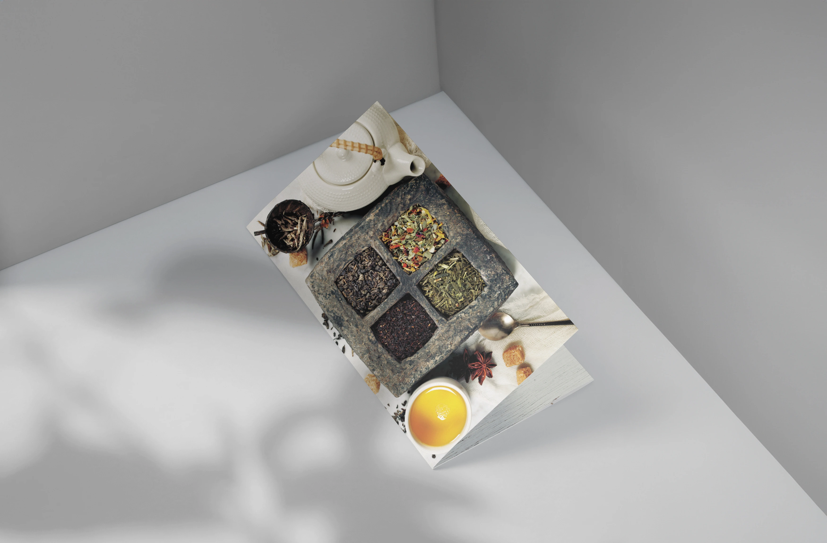
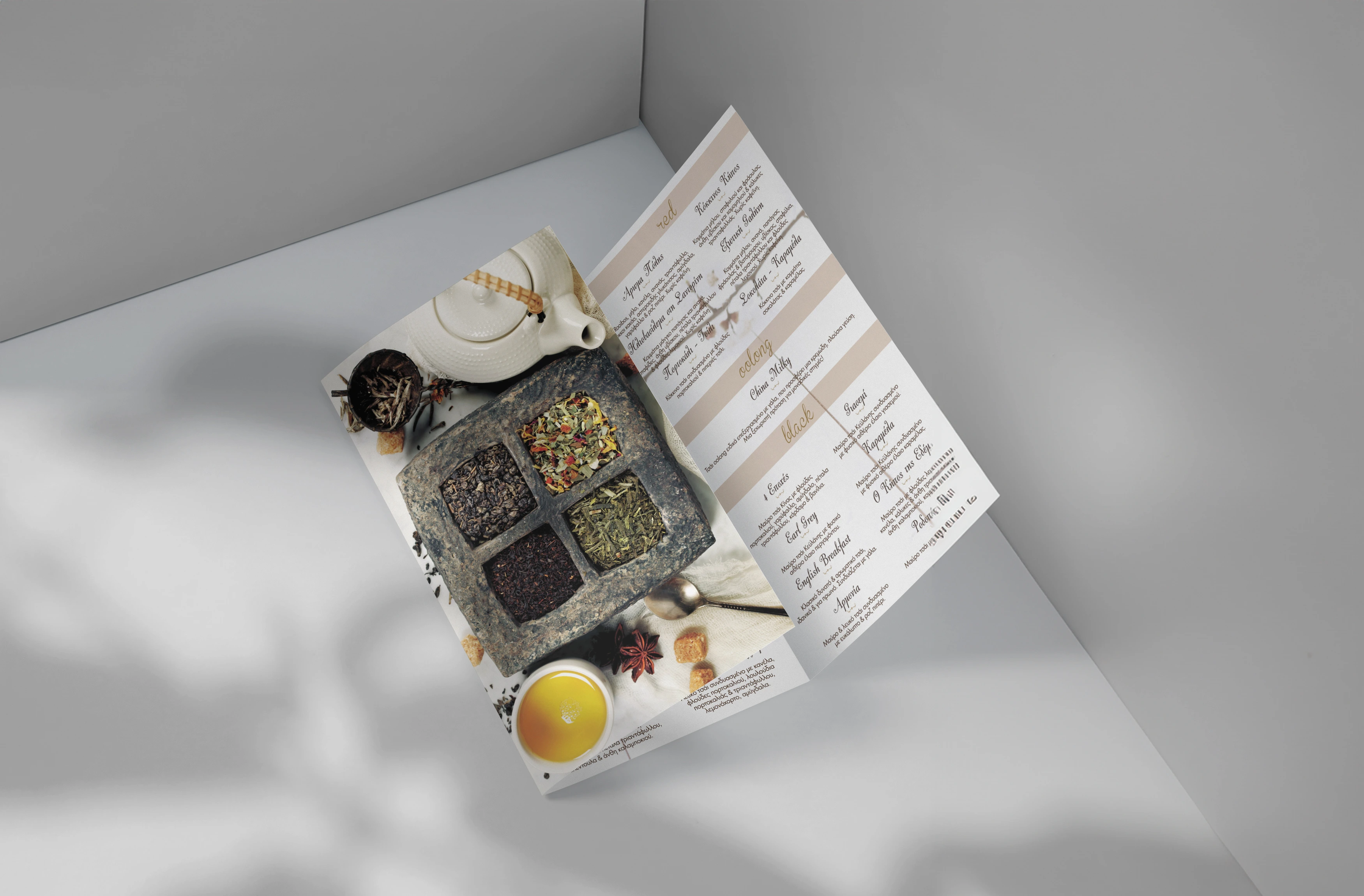
I designed to the folds rather than to the page. The outside opens on the product — the leaves photographed in trays, where the grade and the cut are actually visible — and the listings run along the inside, where there is a flat, uninterrupted stretch for the range to be read in order. Nothing that matters crosses a crease.
The detail
The photography sells and the tables do the work. The range is set as a plain, priced list with enough leading that somebody can find a single line while standing at a counter — the opposite job from the cover, and the reason the two sides of the sheet look nothing alike.
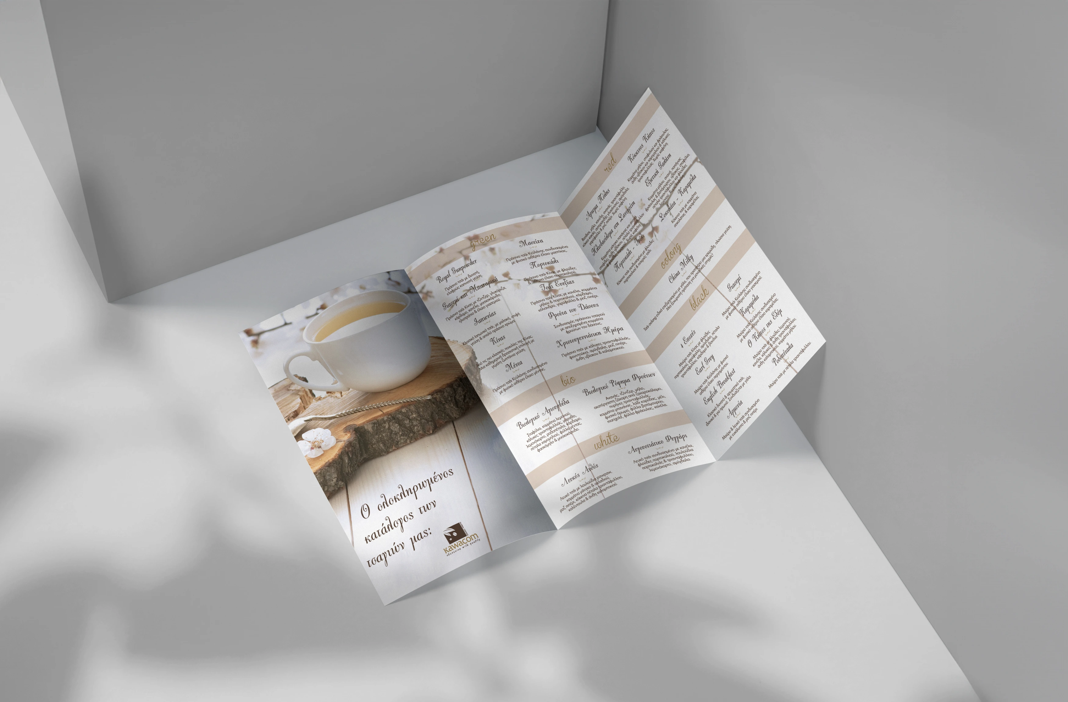
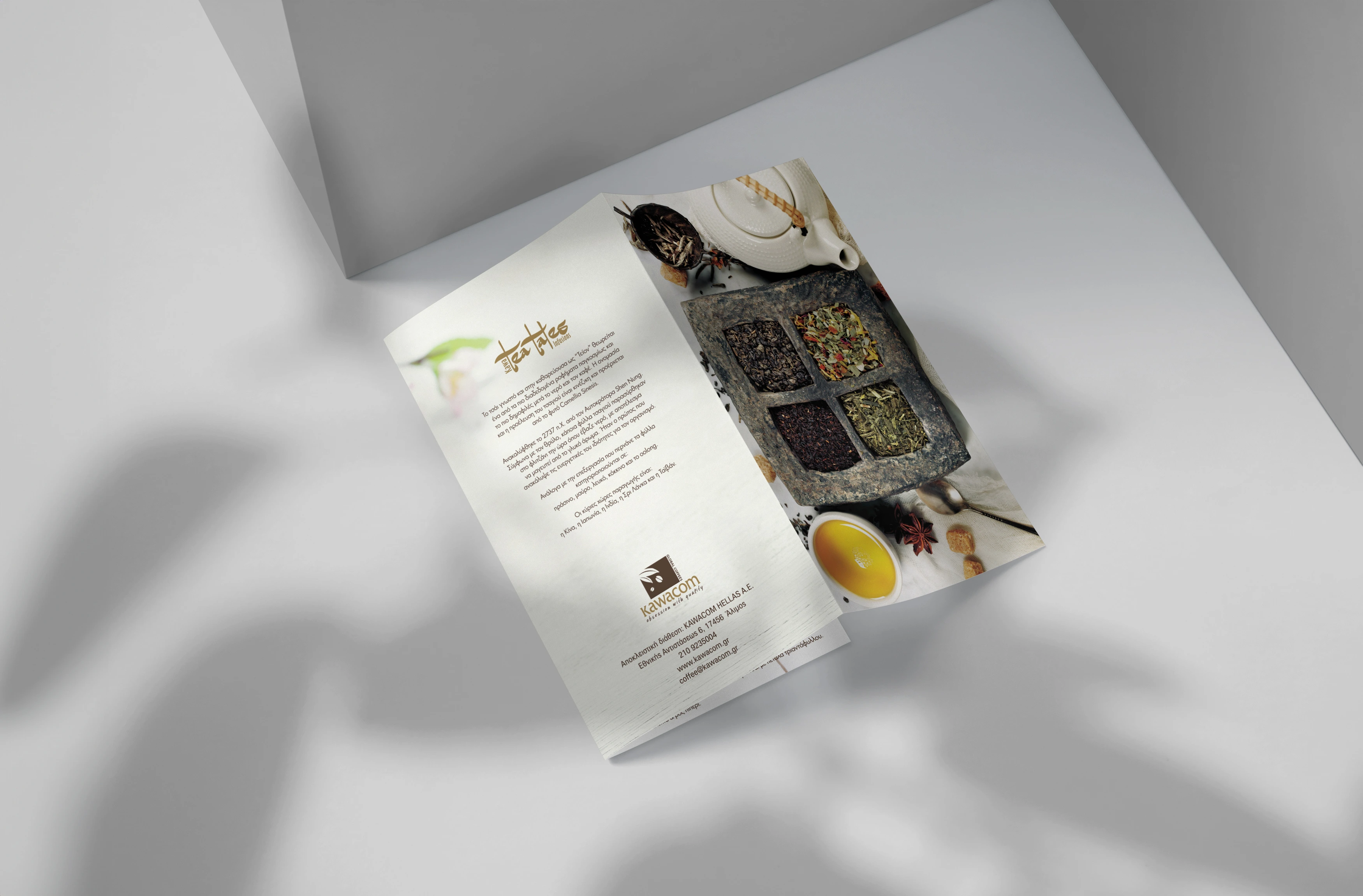
- Tri-fold layout planned around the creases
- Product photography of the loose-leaf range
- The range set as readable, priced listings
- Artwork prepared for print in-house at Art in Red