Ljutri Band Identity
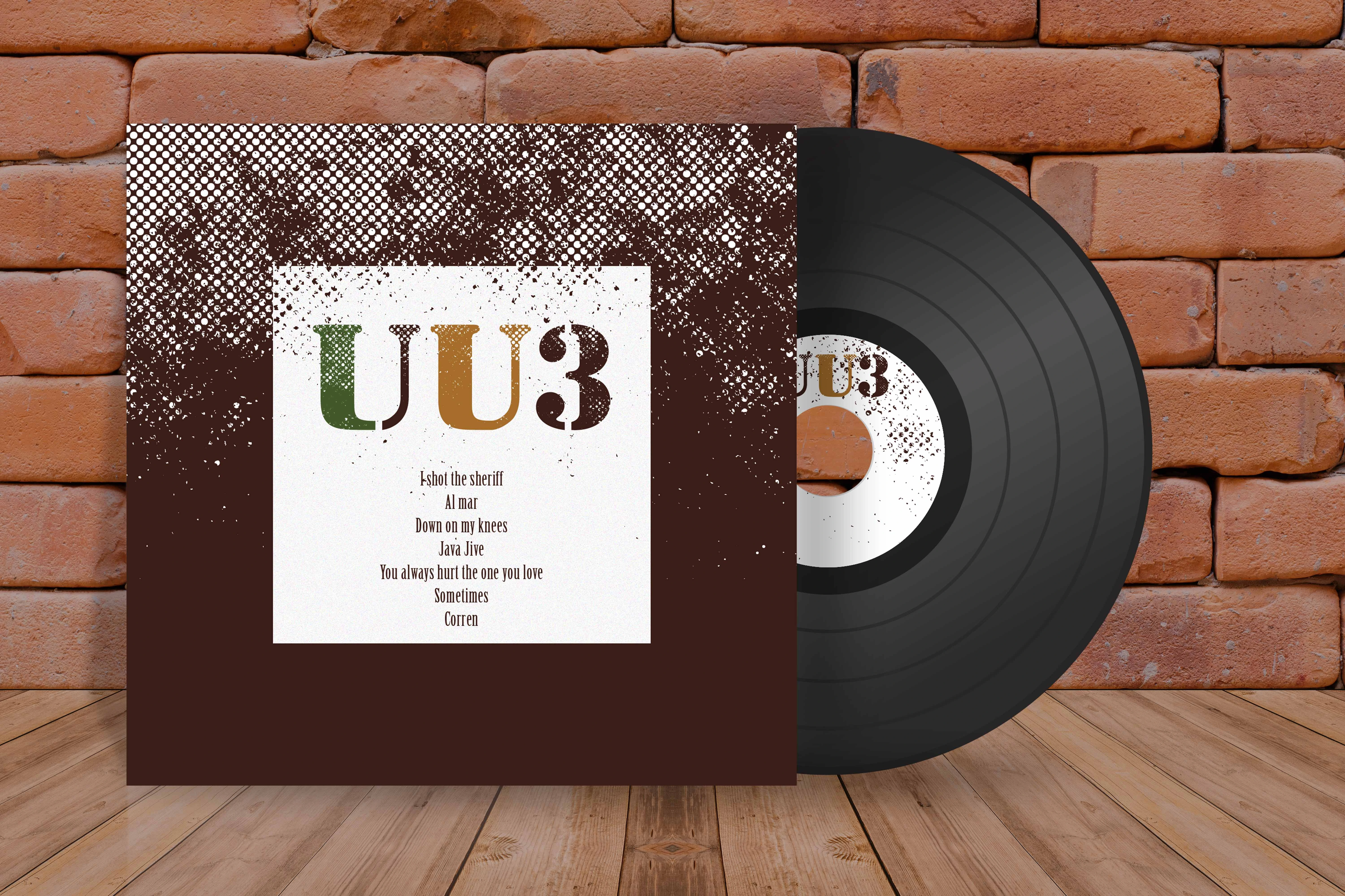
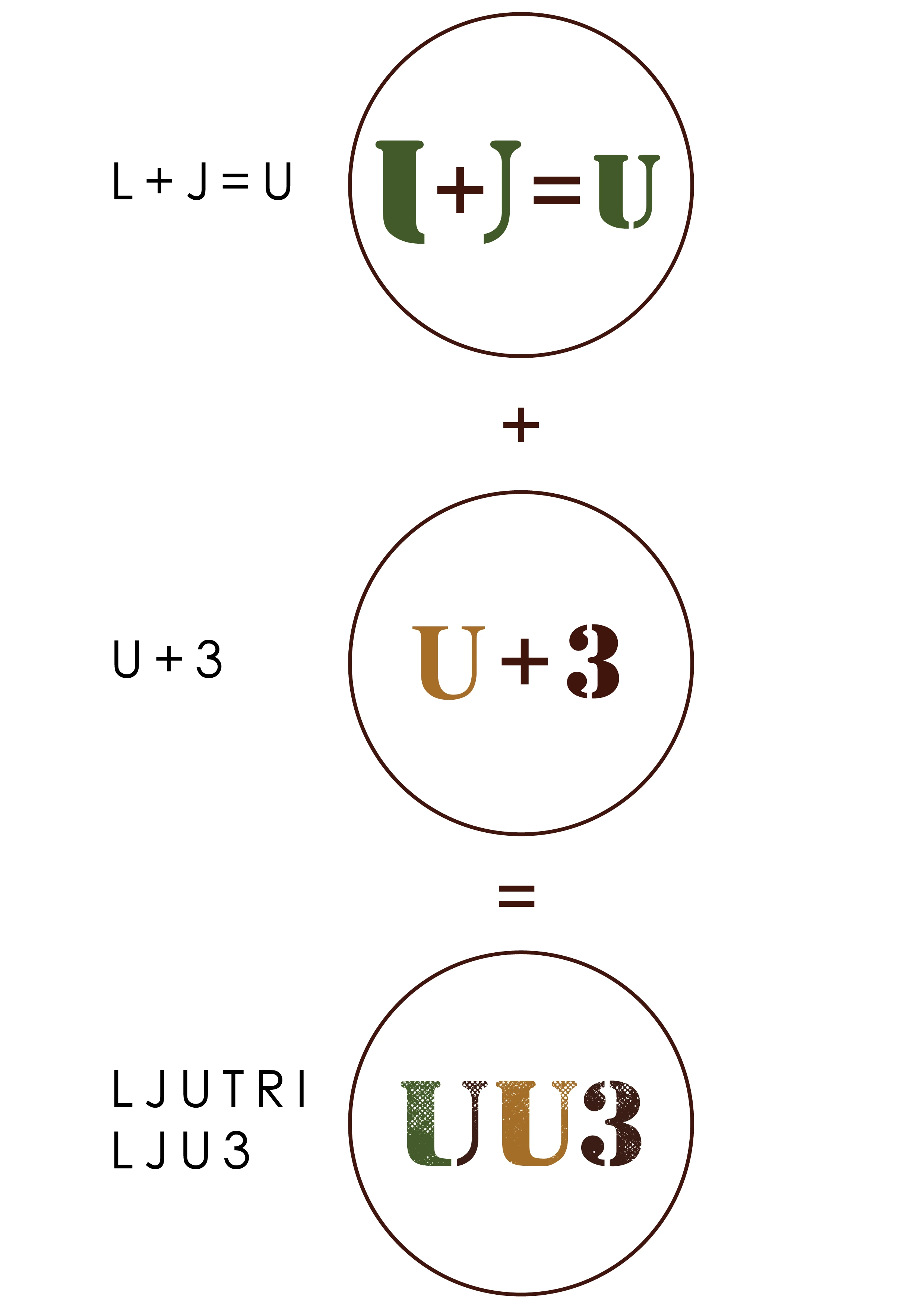
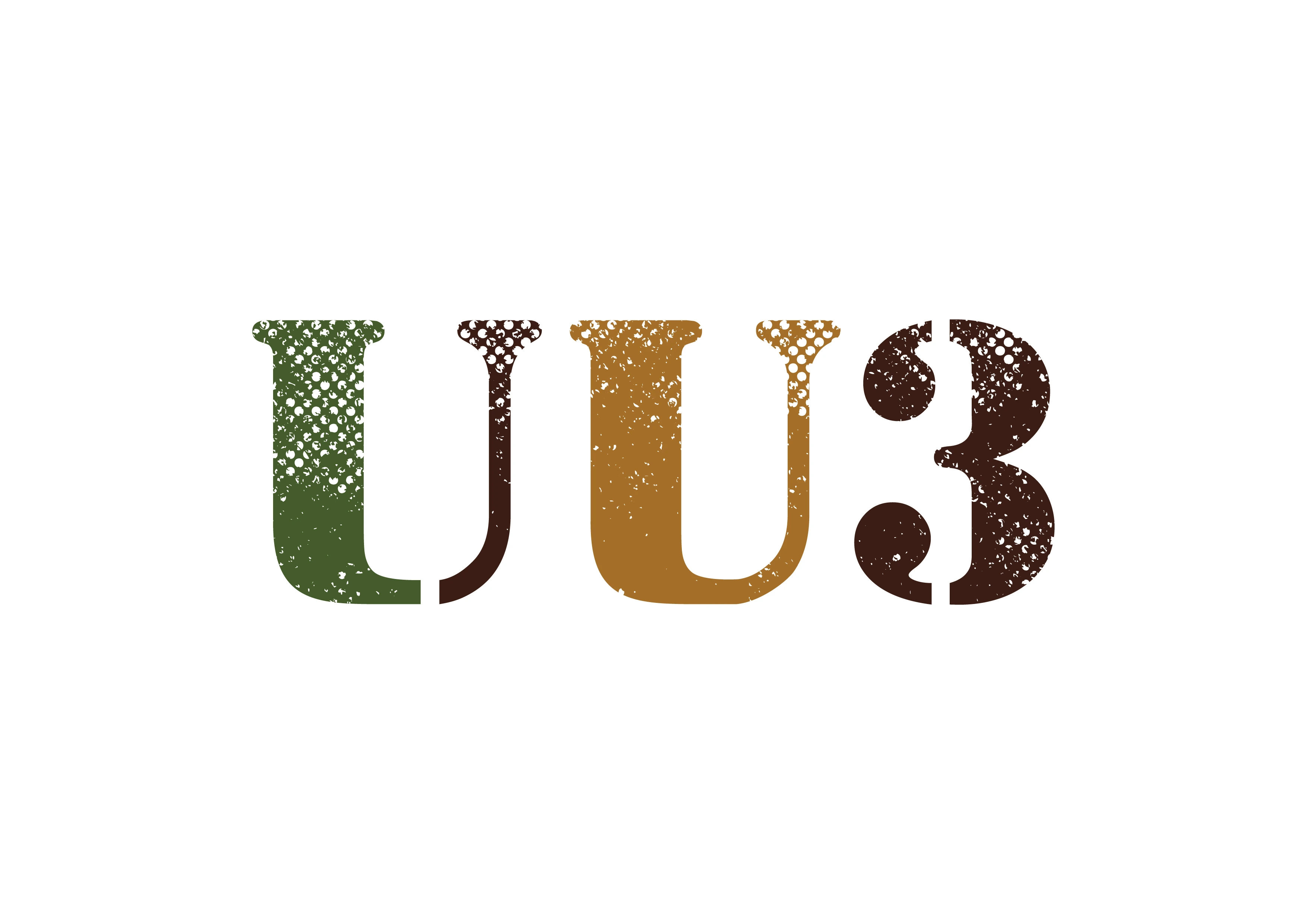
The name is a sum and so is the mark: Ljubljana plus tri, L and J making a U, and the whole band fitting into three characters.
 Ljutri Band Identity
The brief
Three young musicians in Ljubljana, playing modern pop, swing standards and jazz inside the same set, needed an identity before they had a name. Nothing about them was one thing, so nothing about the identity could be either.
The move
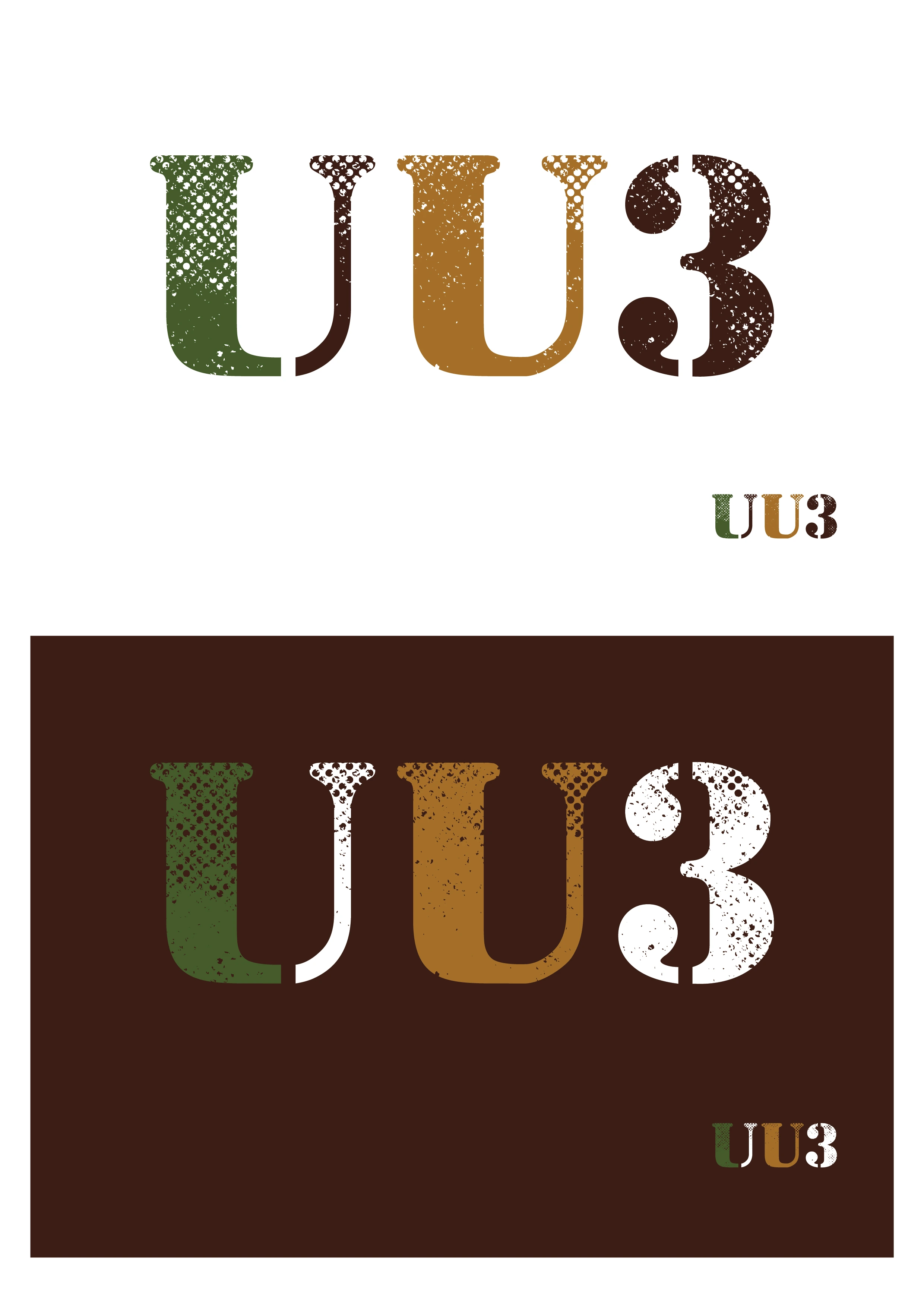
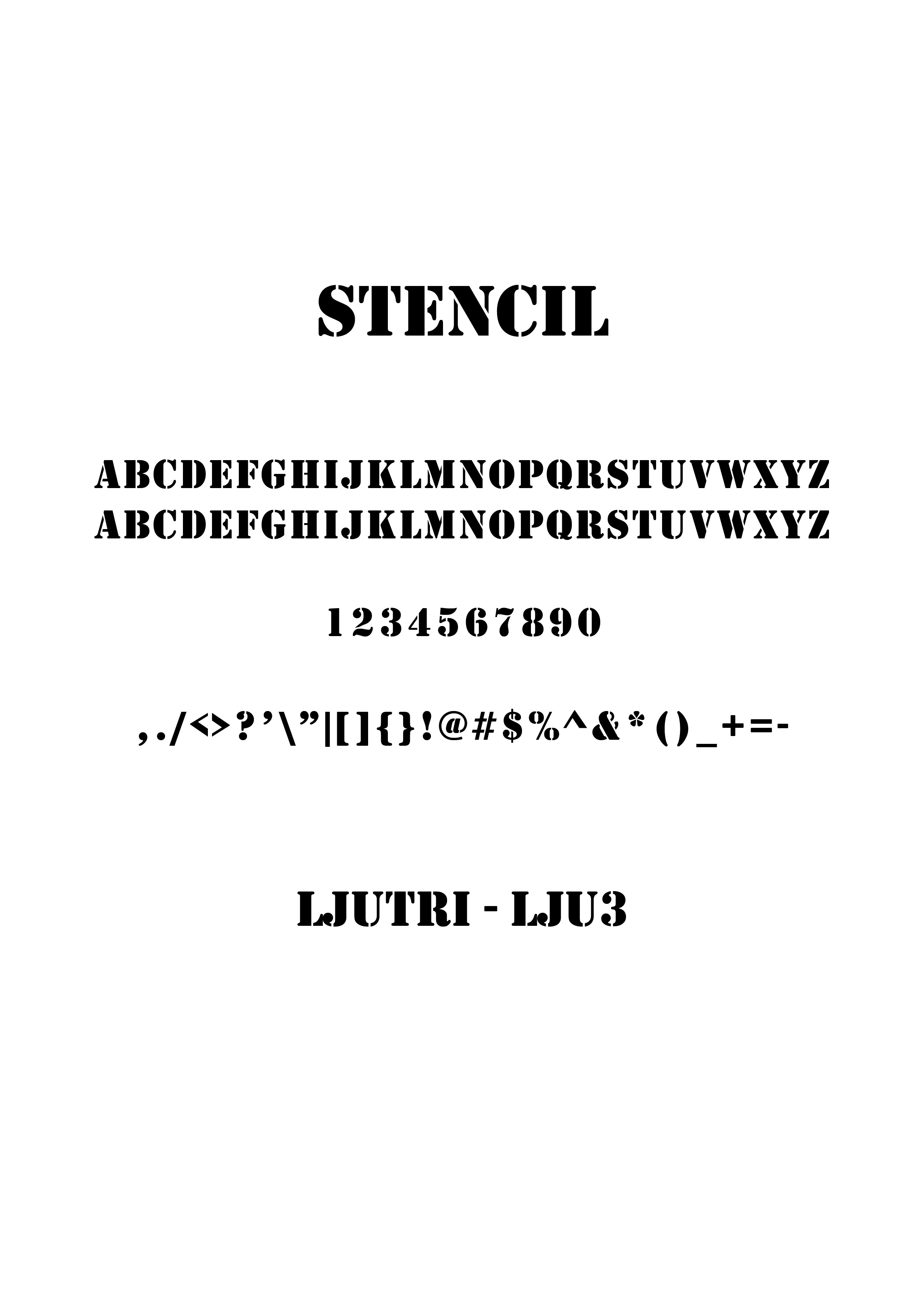
I named them Ljutri — Ljubljana and tri, three in Slovene — and then found the mark inside the name. L and J overlap into a U, the U takes the three, and what is left is UU3: the city, the number and the band in three characters. Stencil letterforms and grain give it the wear of a jazz sleeve rather than the polish of a pop one.
The detail
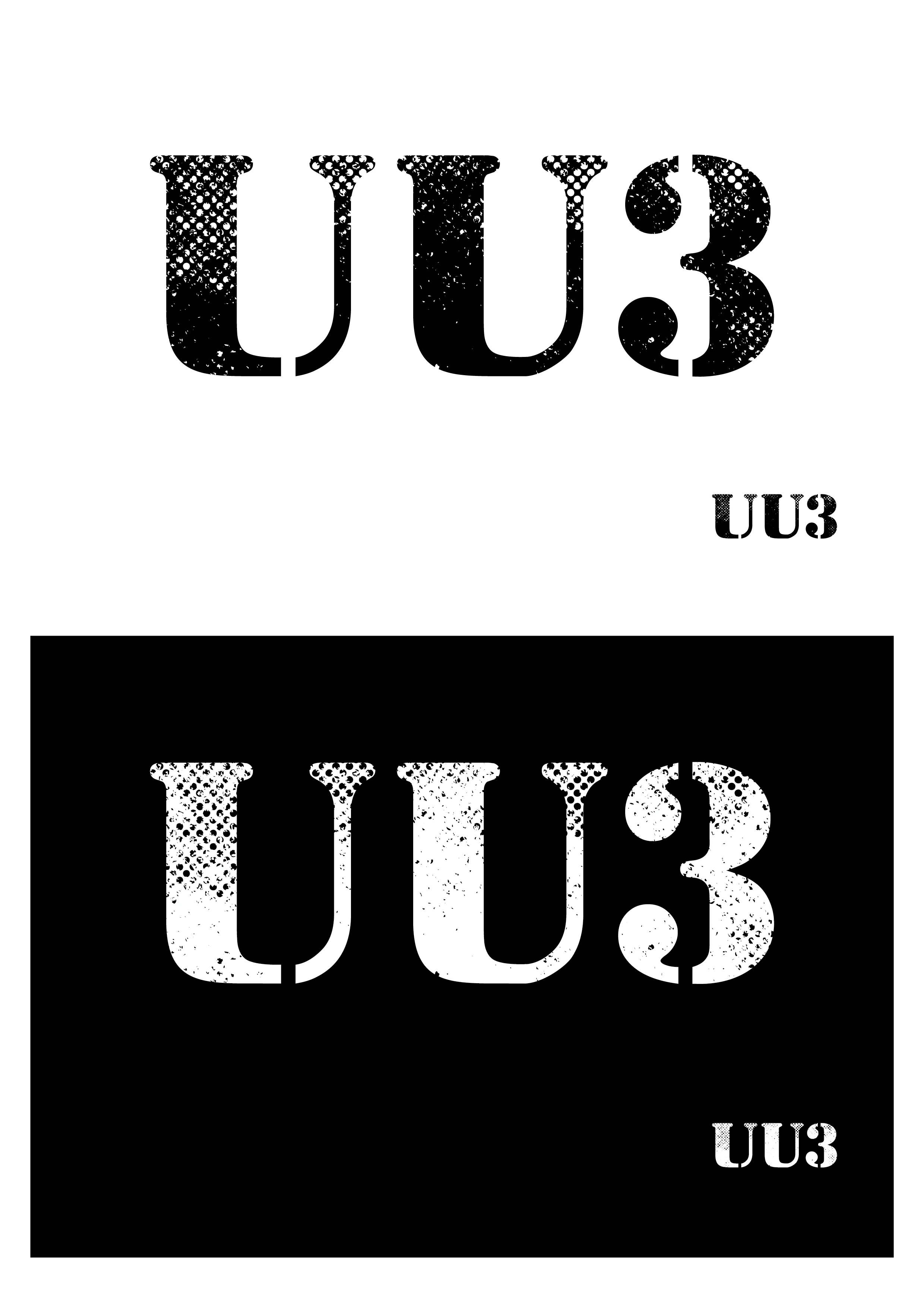
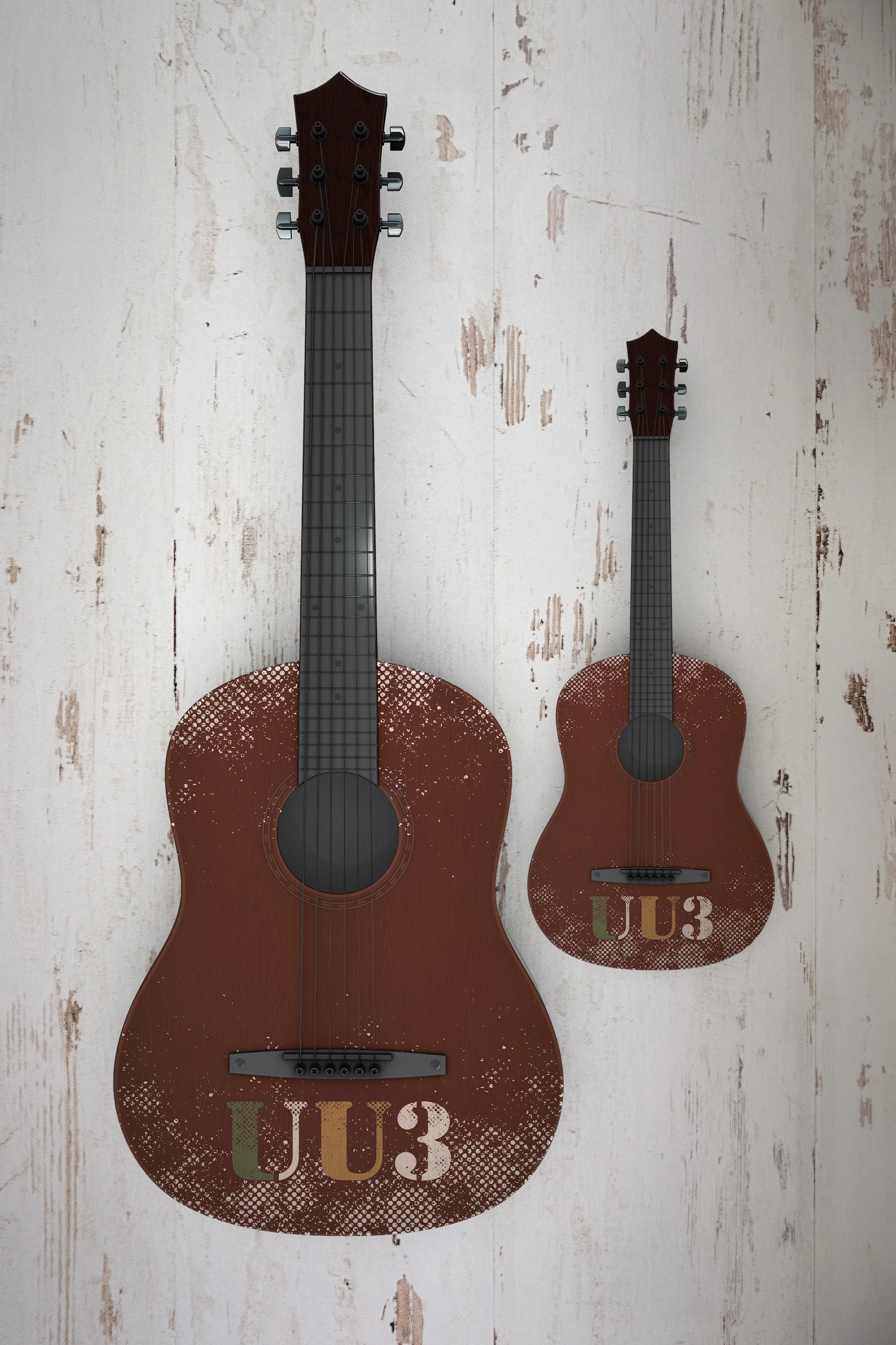
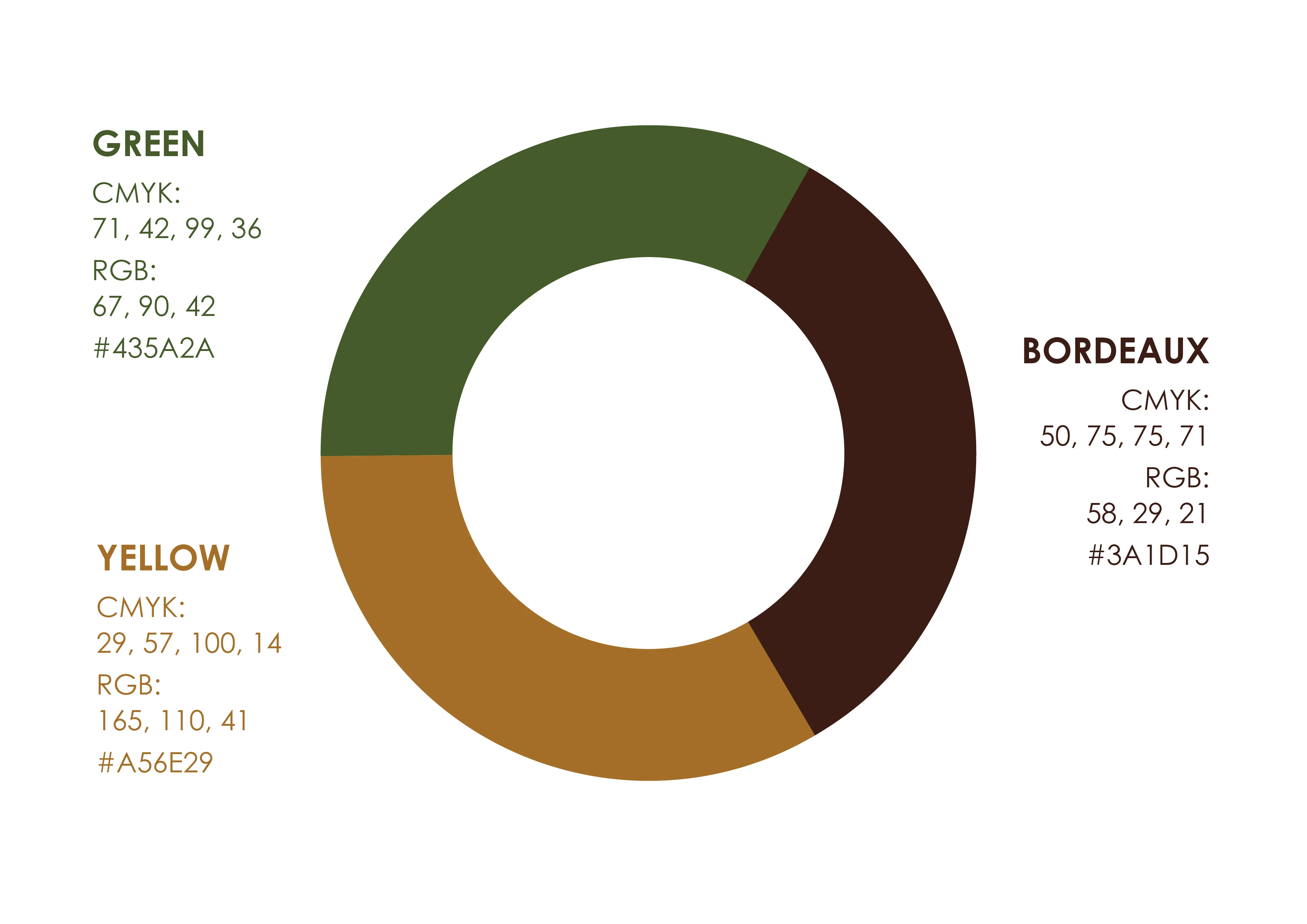
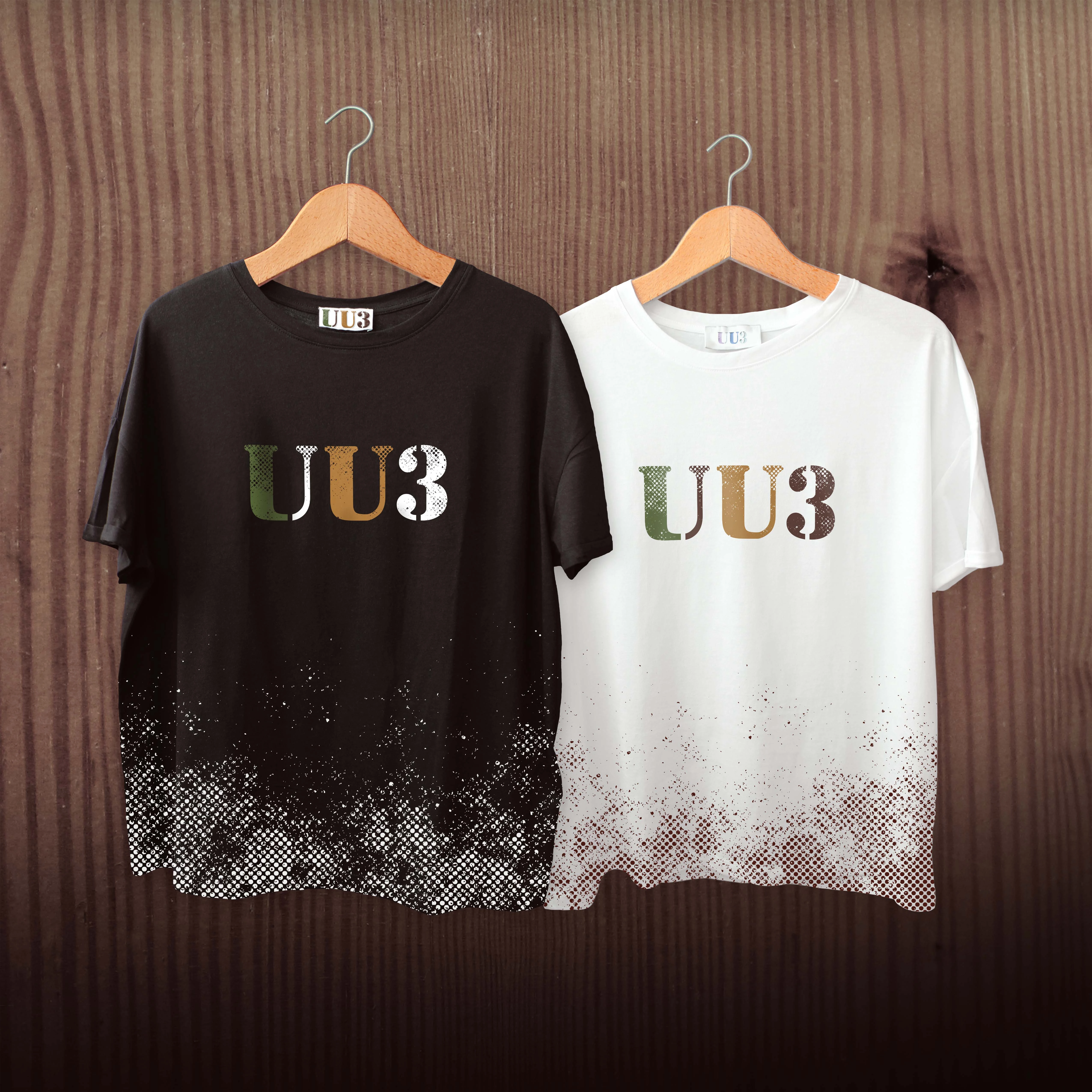
The grain is the whole trick, and it had to be built rather than filtered: the texture is drawn into the letterforms, so the mark keeps its bite screen-printed on a t-shirt, stuck on a guitar, or reduced to the corner of a record sleeve. Green, yellow and bordeaux stay flat behind it, so the texture is the only thing doing the ageing.
- Naming — Ljubljana plus tri, three in Slovene
- Monogram built out of the name: L+J=U, U+3
- Stencil letterforms with grain drawn in, not filtered on
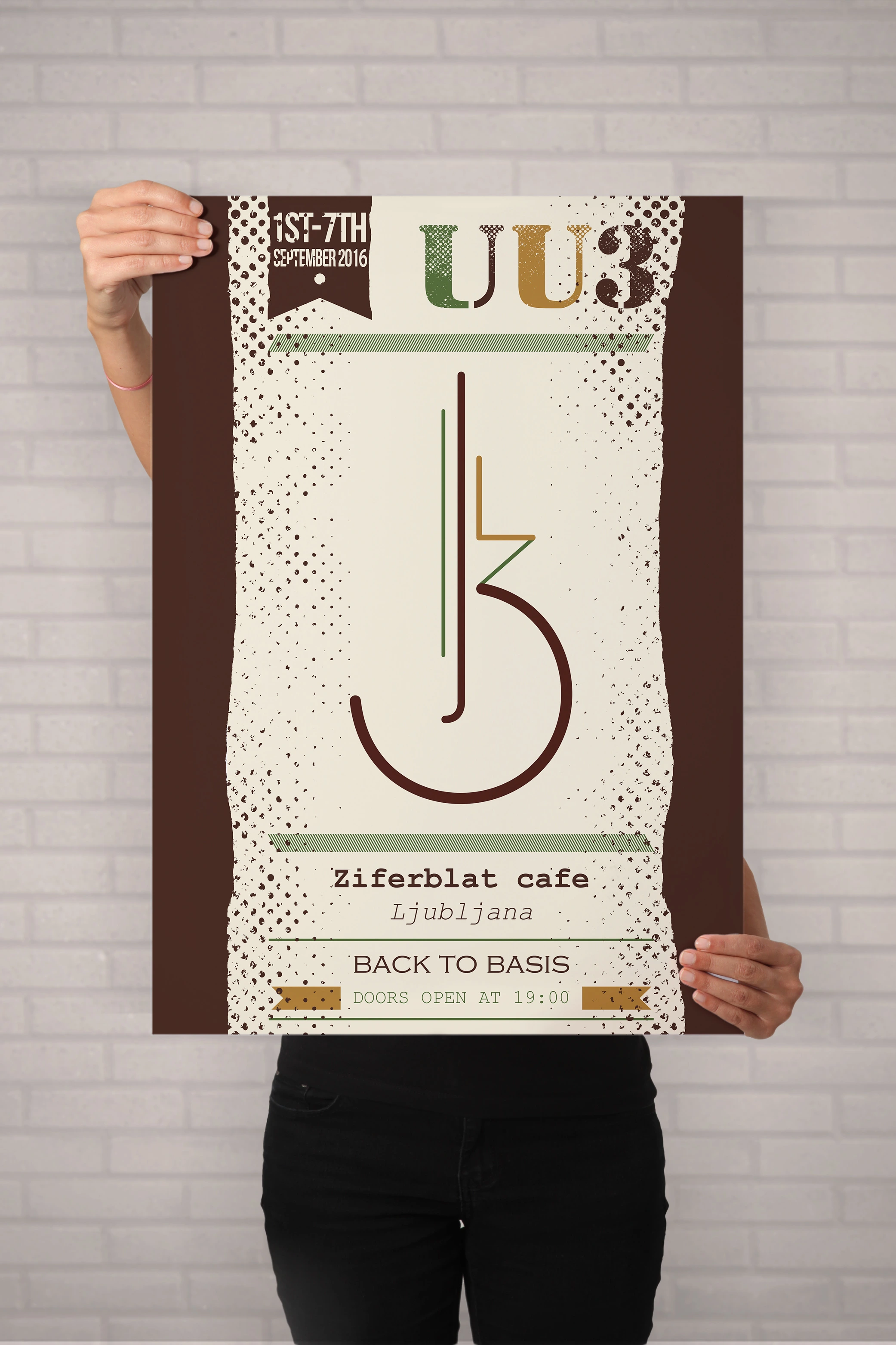
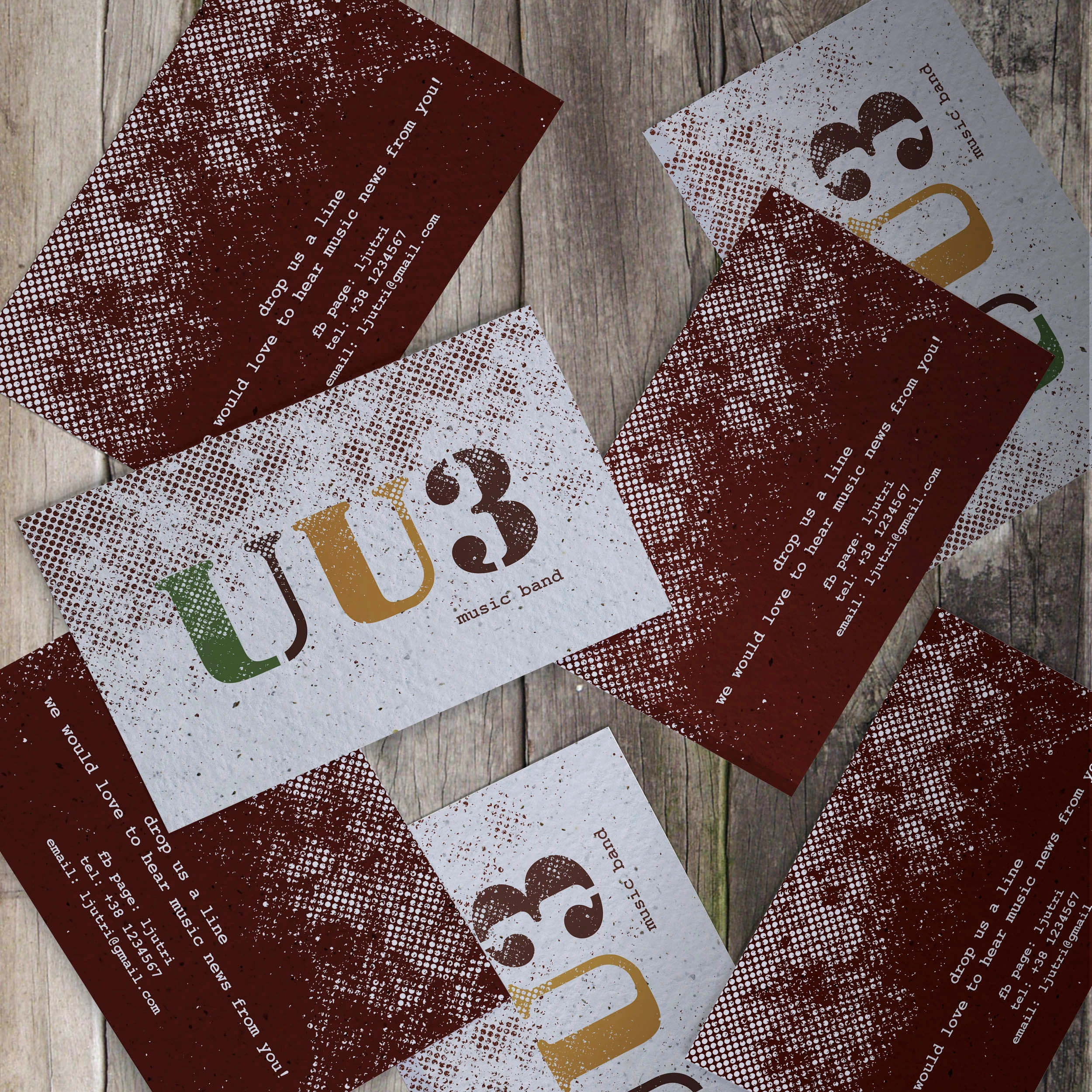
- Cards, poster, record sleeve, t-shirts and instrument marks