Persi Angel Rebranding
One mark, three readings without changing shape: a halo, a golden ring, and a drop that is also a leaf.
 Persi Angel Rebranding
The brief
Persi Angel sells natural products and cosmetics in Slovenia, in a category where every competitor reaches for the same leaf. The identity had to say care and premium in the same breath — the promise of a spa rather than a shelf in a health-food shop.
The move
I drew the mark to be read three ways at once. The halo carries the angelic care the name already promises; read again it is a golden ring, and that is where the premium comes from; stacked, the two rings sit like the black stones on a spa table. Above them the drop is half water, half leaf — the mineral and the plant in one form.
The detail
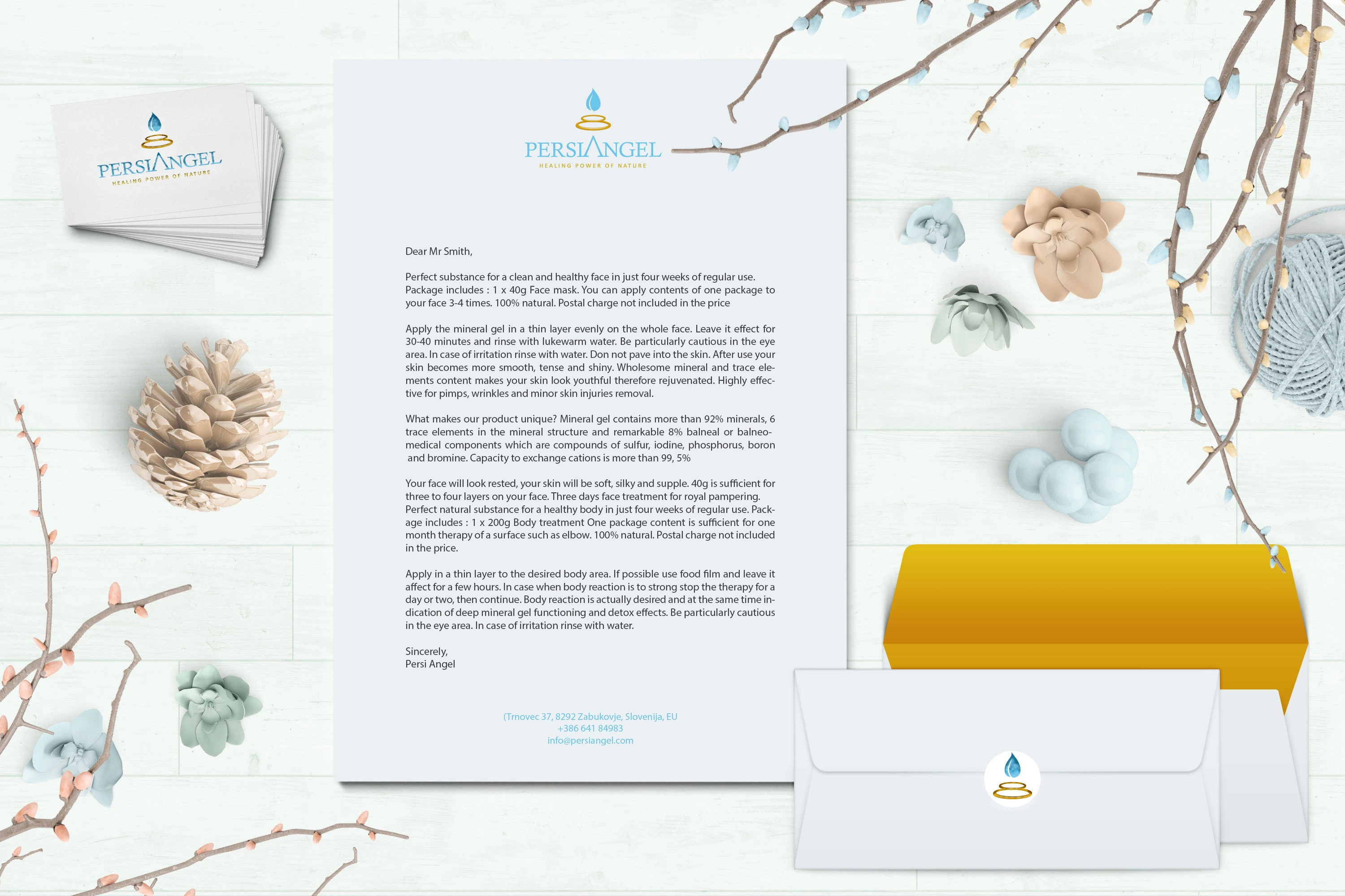
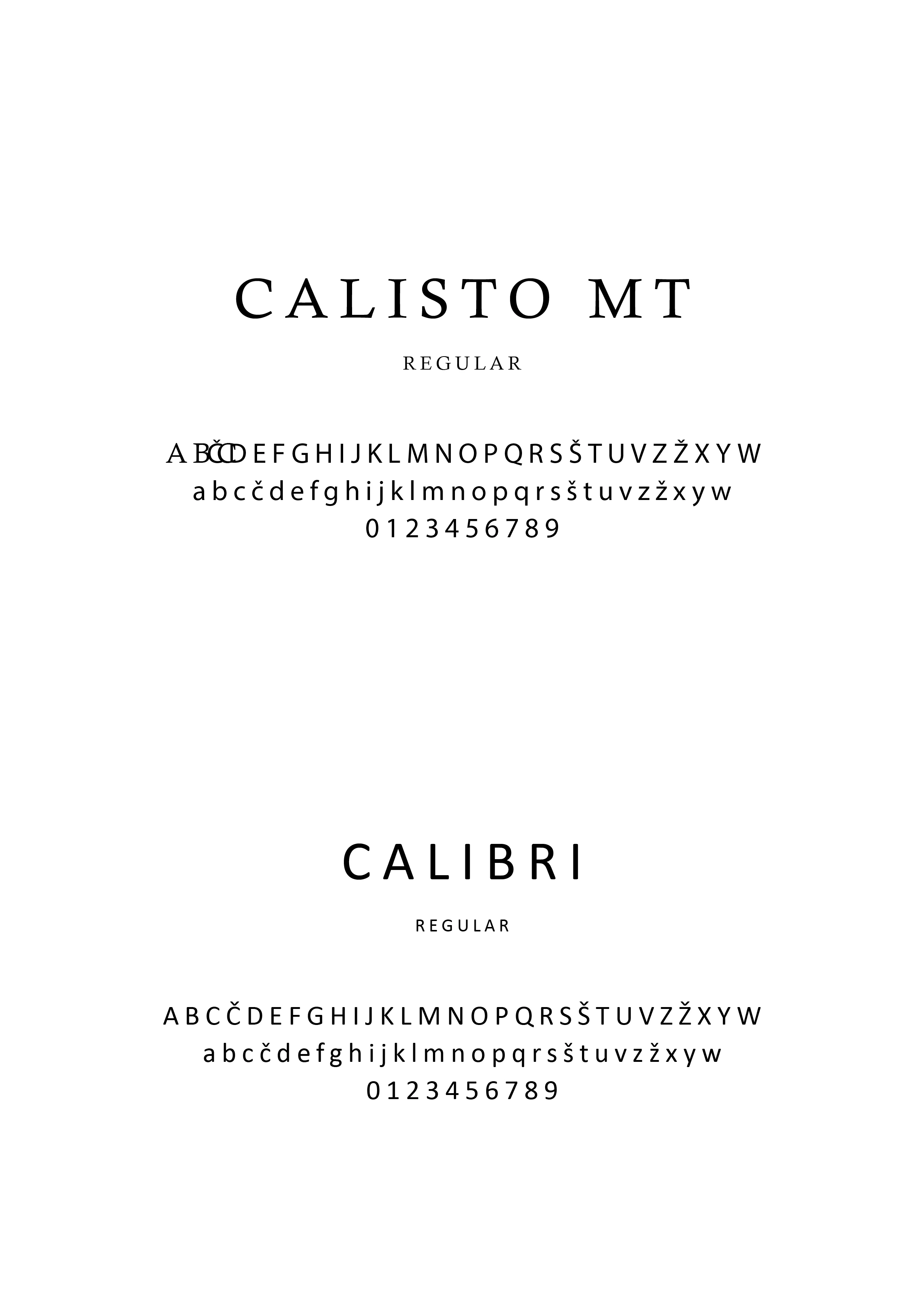
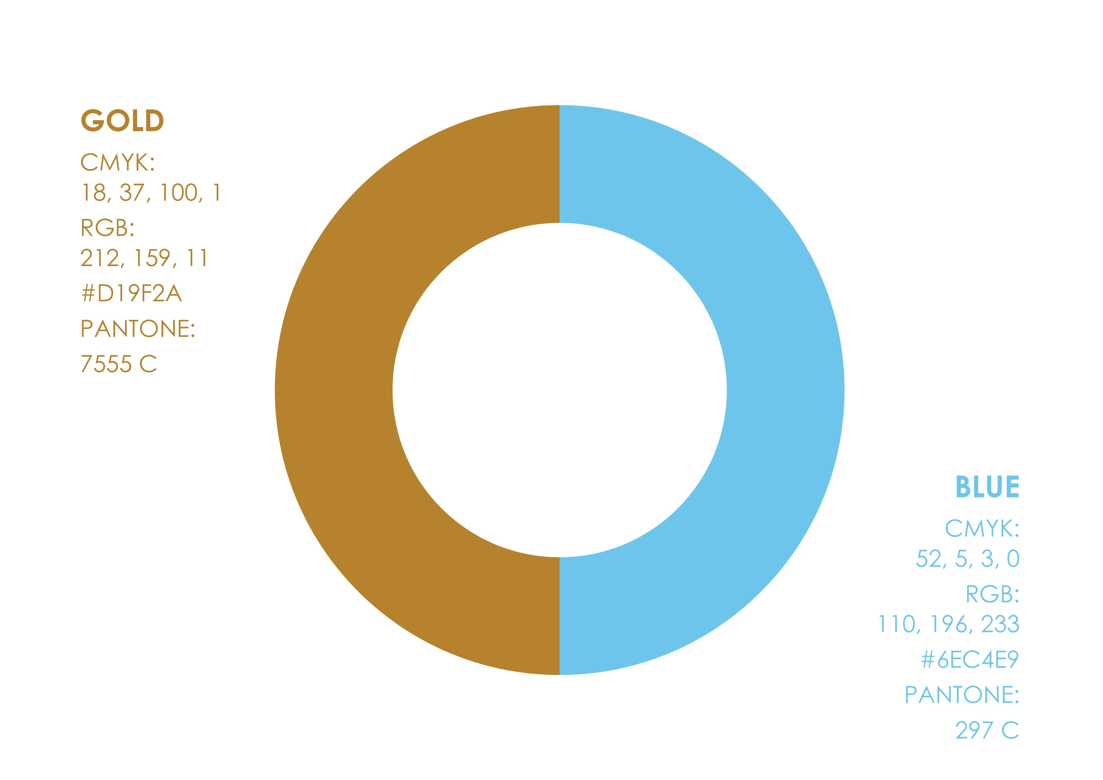
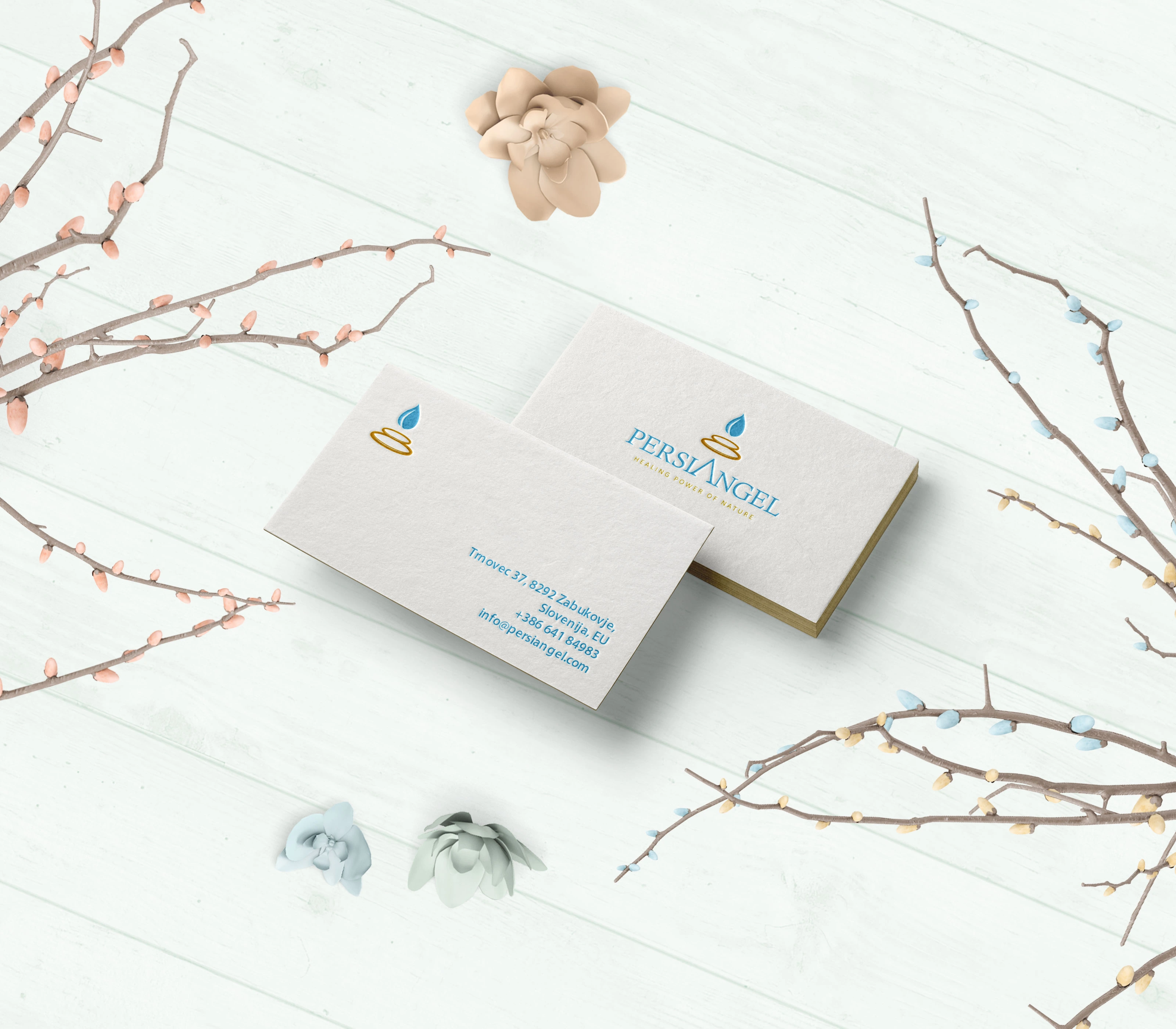
Everything after the mark is restraint. Two colours, gold and blue, and Calisto MT paired with Calibri, so the identity holds on a business card, on a letterhead, and blind-embossed with no colour at all. The construction sheet is part of the delivery: the mark had to be rebuildable by whoever came next.
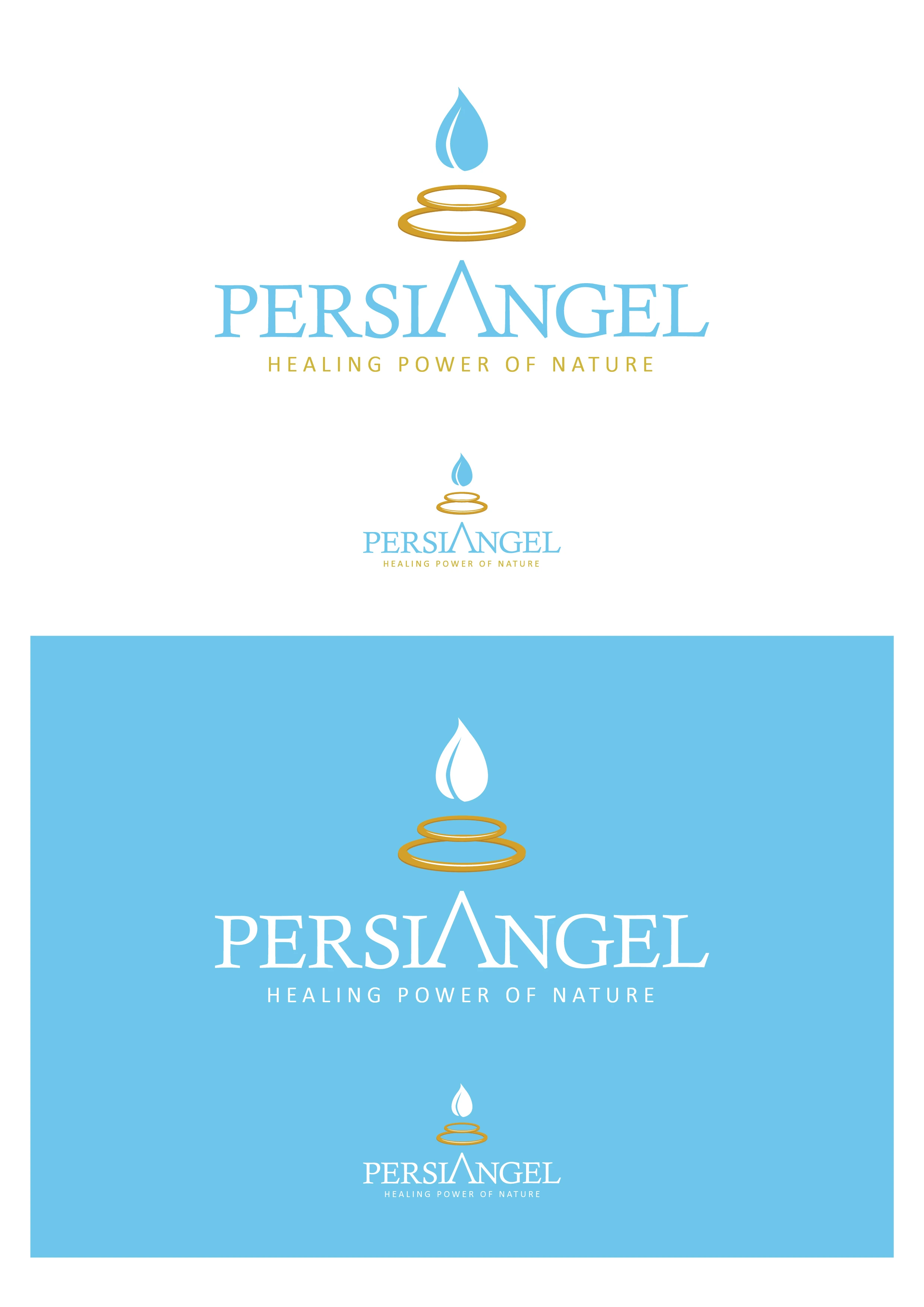
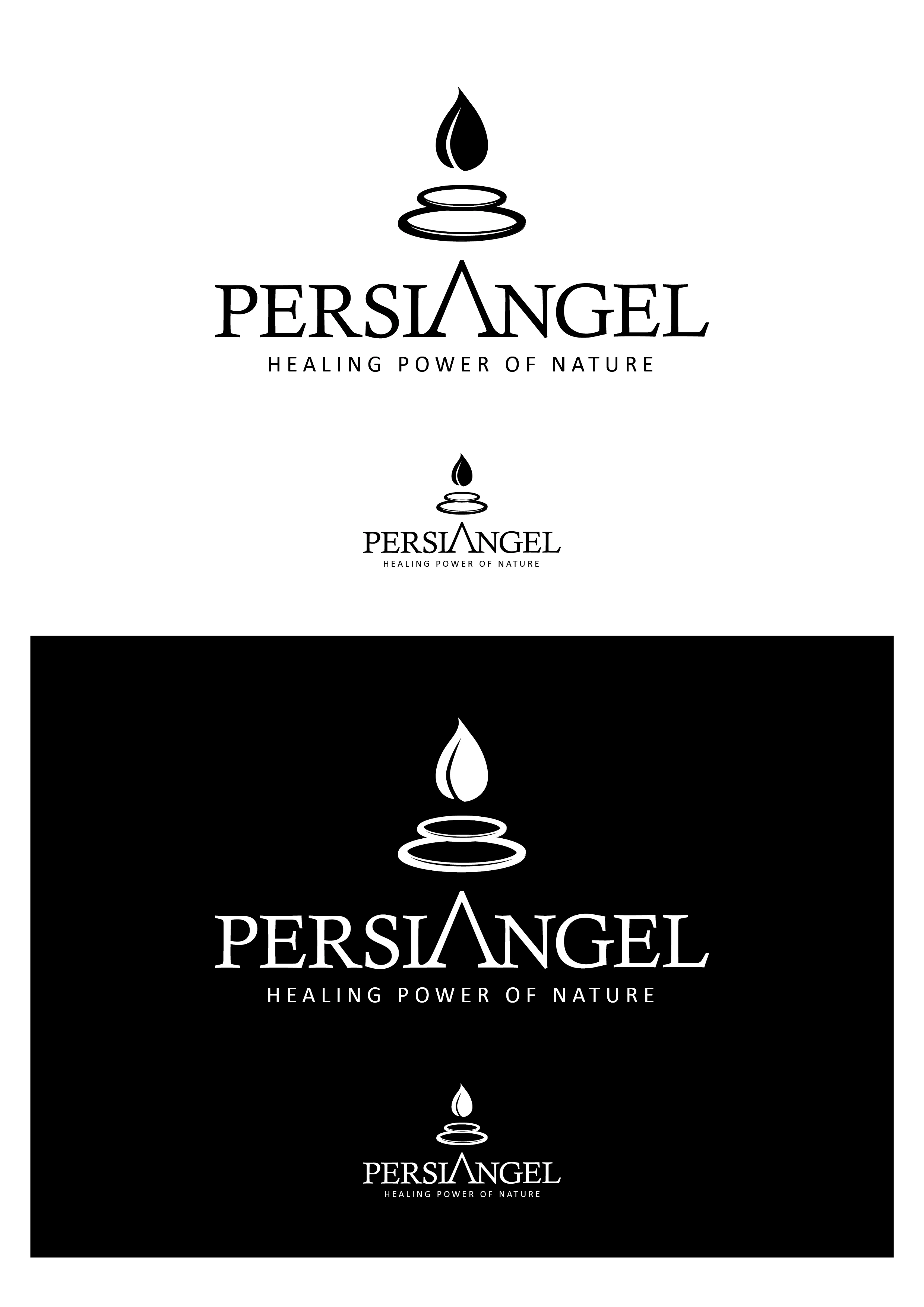
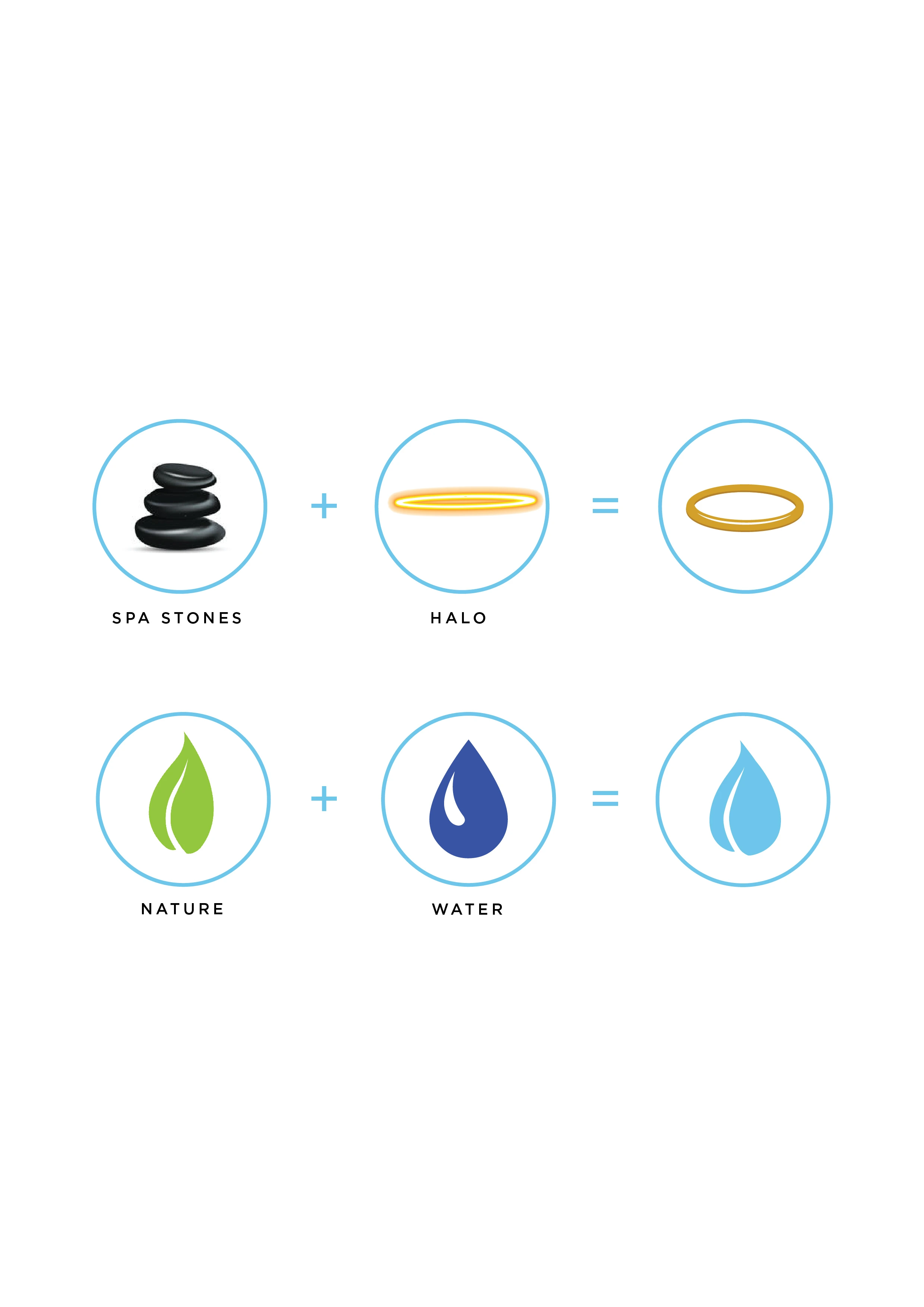
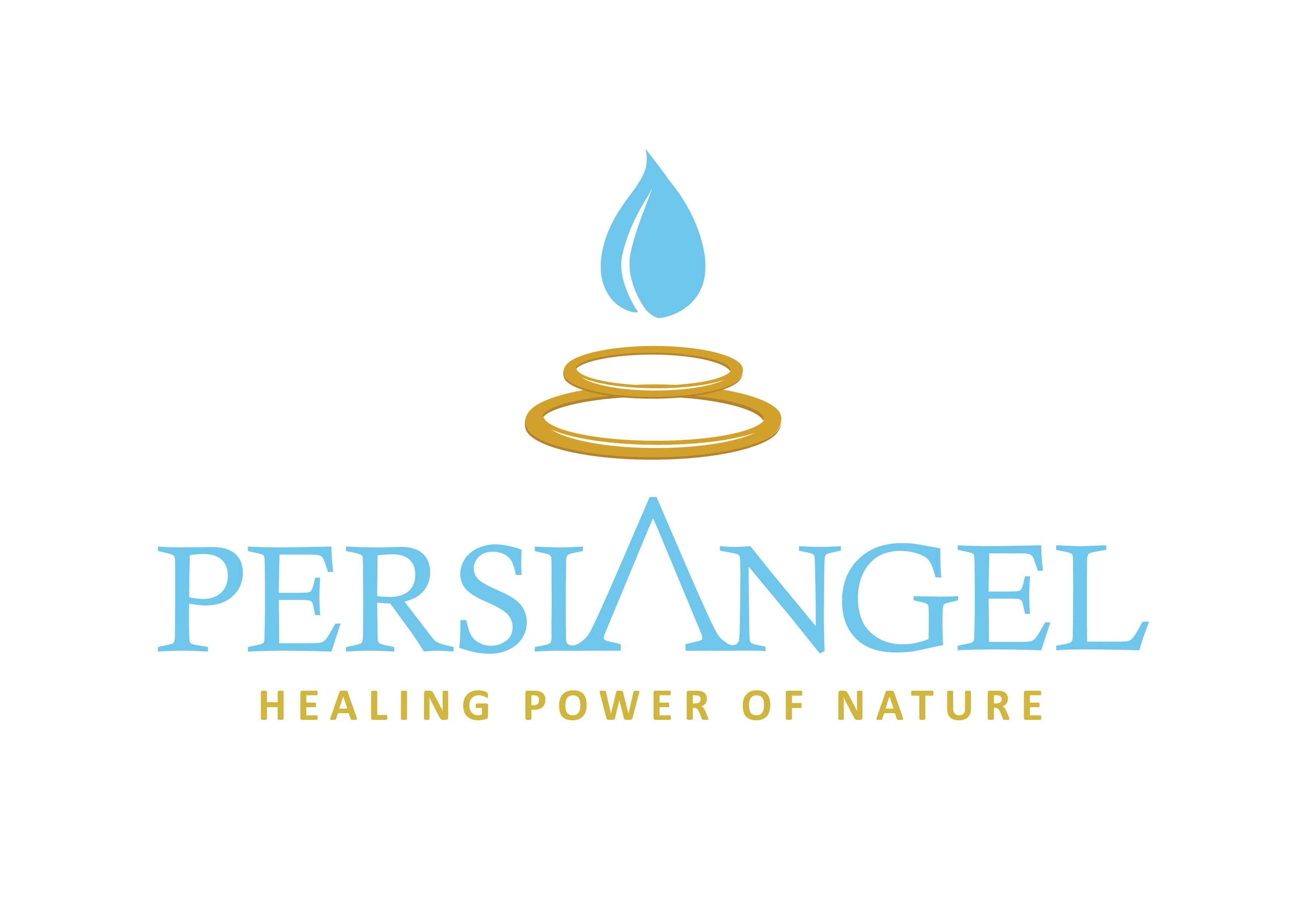
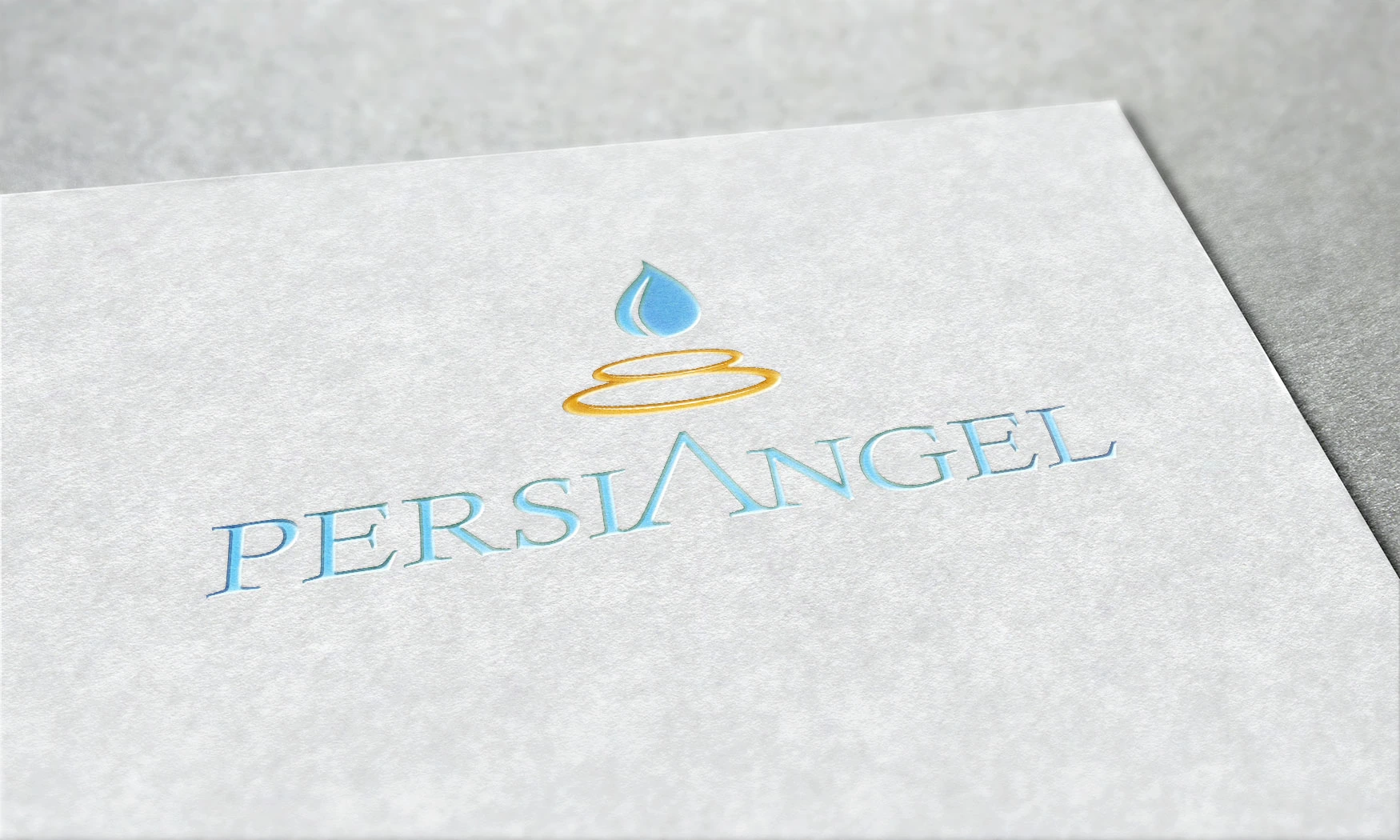
- Mark built from halo, ring and drop in a single form
- Two-colour system, gold and blue, with Pantone equivalents
- Calisto MT and Calibri as the typographic pair
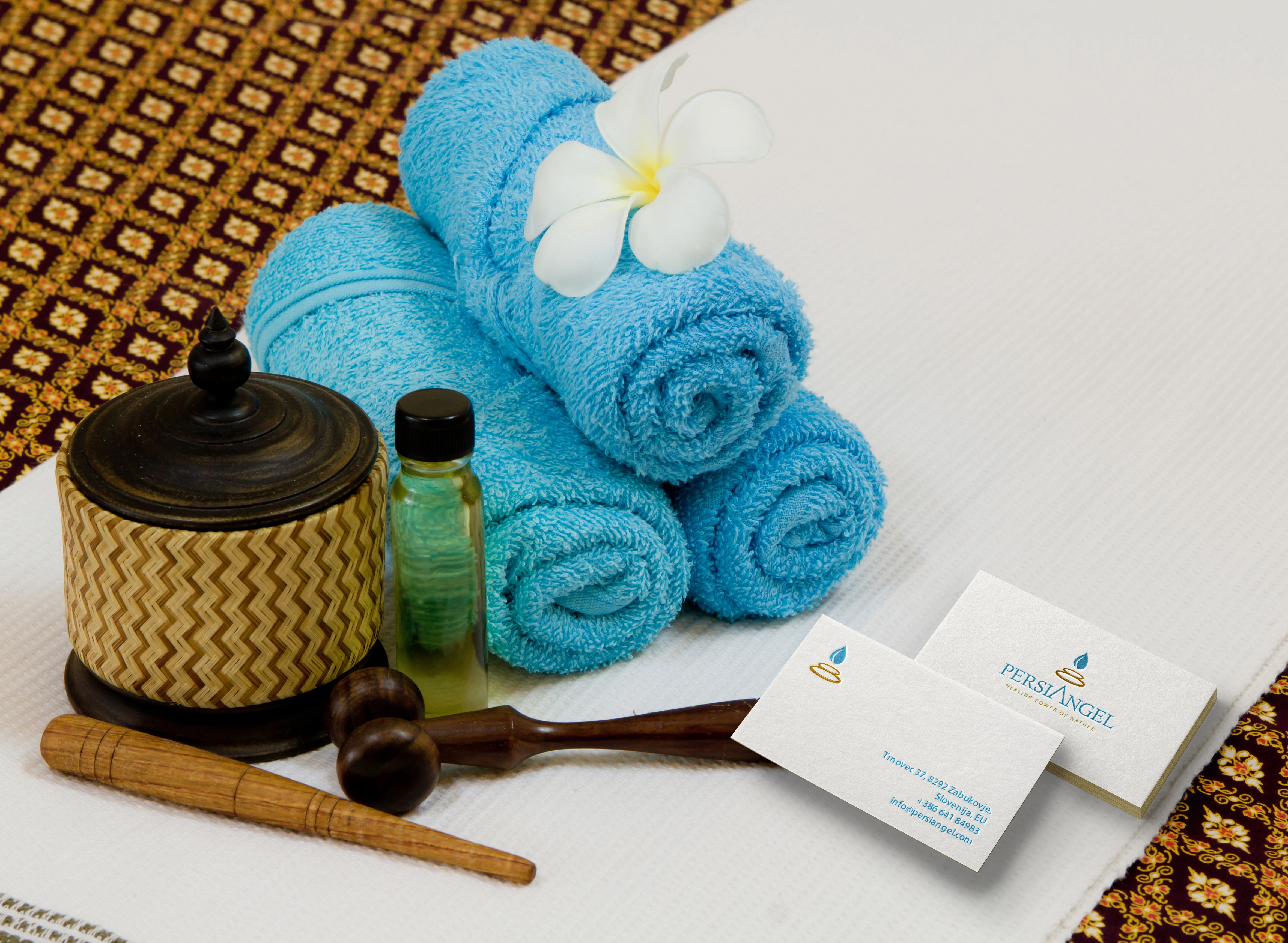
- Stationery and blind-embossed applications