Teran Liquor Label
Parched earth on a bottle: the terroir is the first thing you touch, before a word is read.
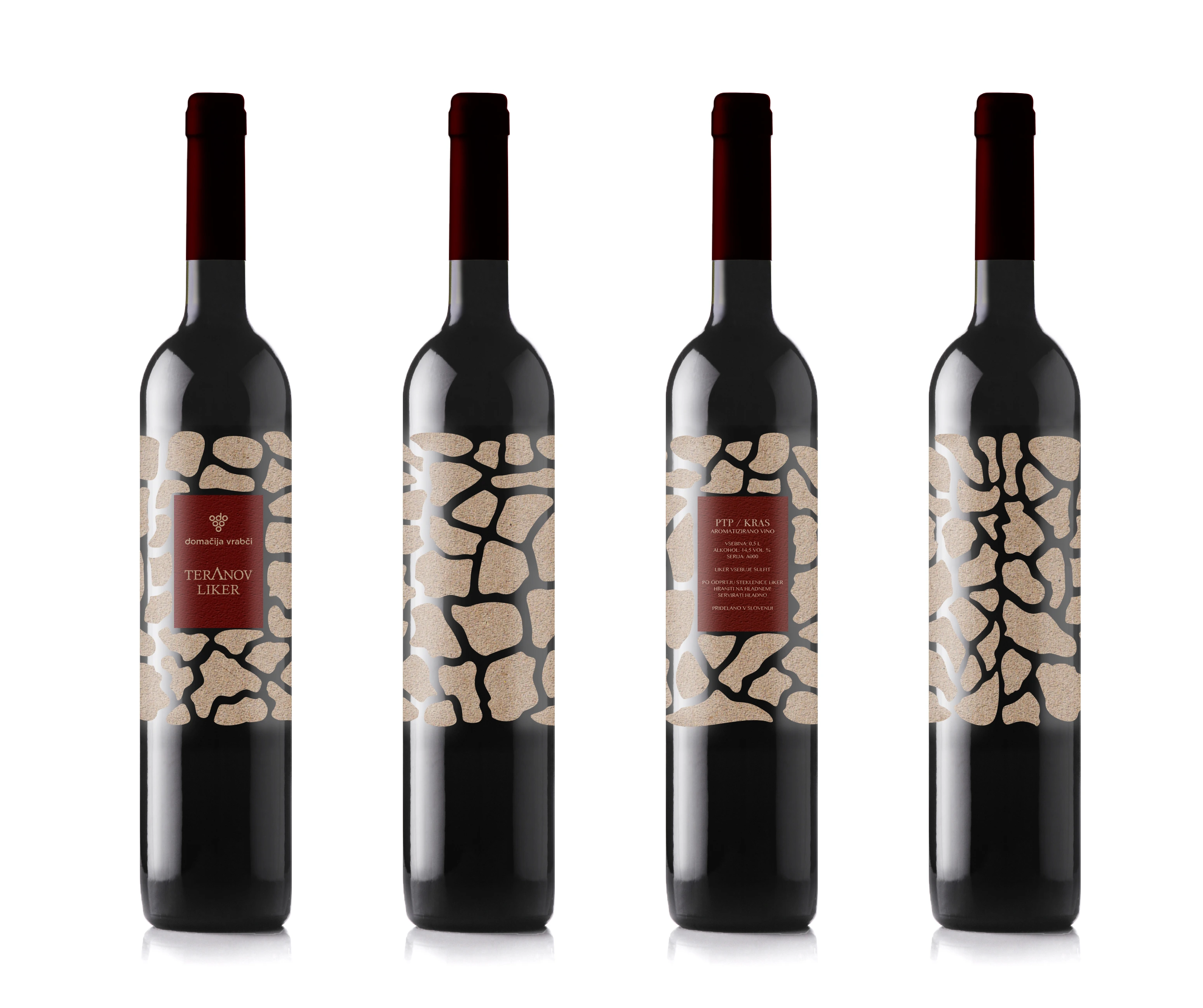 Teran Liquor Label
The brief
Teran Liquor needed a label for a spirit made from a grape that only tastes like itself in one place — the karst of Slovenia. The bottle had to carry that origin to people who will never see the land, and hold its own beside labels that all reach for the same heritage cues.
The move
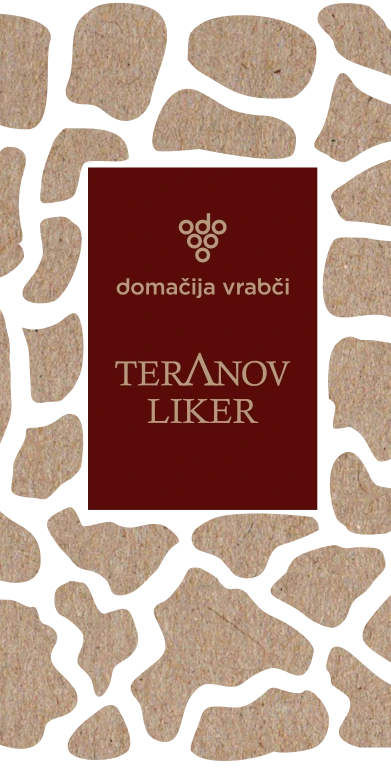
I made the label the ground. A coarse, textured surface and strategic cuts stand in for cracked, dry earth, and the elements repeat in a deliberate sequence so the pattern reads as continuous — no beginning and no end, the way the terrain does not stop at the edge of a vineyard.
The detail
The cuts are structural, not decorative: they break the rectangle so the label stops looking applied and starts looking like part of the bottle. Texture does the rest — on an uncoated stock the ink sits into the surface and the front panel feels dry under the thumb.
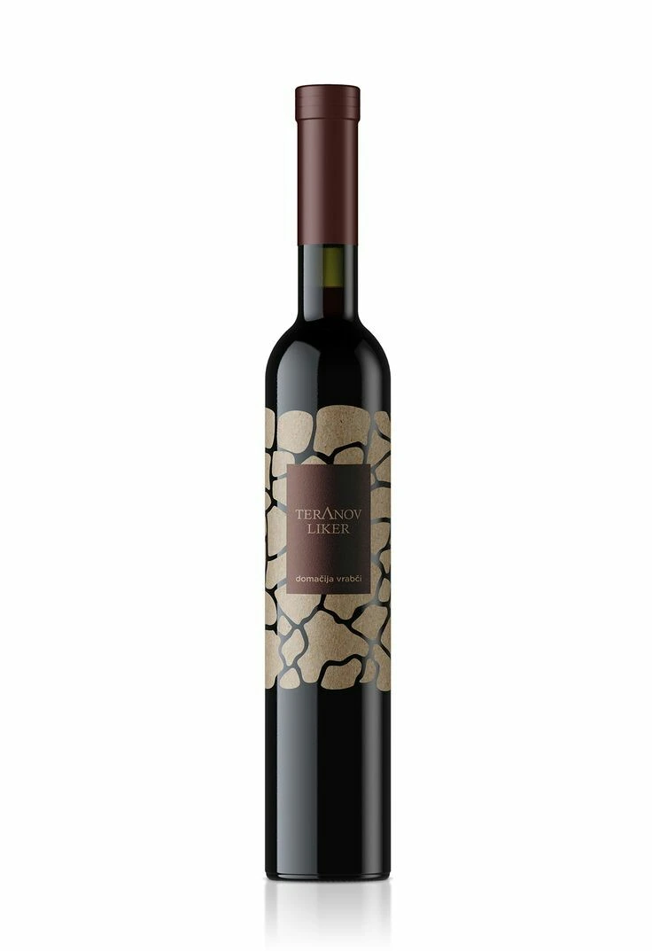
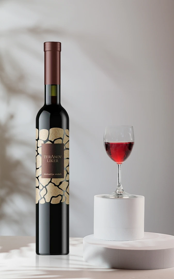
- Die-cut label, texture carried by an uncoated stock
- Pattern set to repeat without a visible seam
- Front and back panels approved wrapped on the bottle